
E-commerce design | Quintana
2023

Project Overview
E-commerce design for boutique hairdresser and storefront in Tenerife, with no digital presence to deliver great online shopping experiences
Roles
UX/UI Designer

4-person collaborative project

Figma

Our client
Our client is a beauty salon called “Quintana” established in Tenerife in the Canary islands. The business is run by Yayi, an entrepreneur woman who knows exactly what she wants and isn’t afraid to show her true self. Yayi transfers all her values to her business, which apart from the main beauty services has the bonus of selling clothes and accessories for women of all ages. This allows her clients to find everything they need in just one place to get ready for any upcoming event.
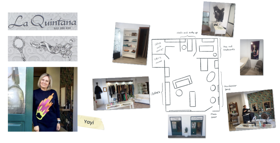
Quintana has the experience, an established team and a steady clientele, but no web presence, which makes it the perfect business to partner with.
Agenda
UX Part
Stakeholder Interview
Competitive Analysis
User Interview
Affinity Diagram & Empathy Map
User Persona
User Journey Map
Problem Statement
Ideation & Crazy 8’s
MOSCOW Method & MVP
Sitemap & User Flow
Low-Fidelity Prototype & Testing
Mid-Fidelity Prototype & Testing
UI Part
Visual Competitive Analysis
Brand Attributes & Moodboard
Style Tile
High-Fidelity Prototype
Responsive Design
Next steps & Learnings
UX Part
First of all, we need to understand the context of the business, its customers and the beauty salon market to offer a valuable solution.
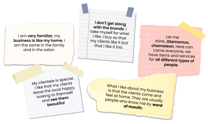
Stakeholder Interview
First of all, we wanted to get to know Yayi the business owner and talk with her about the business and the clients, to find out more about their strengths, weaknesses and goals. These are some of the things she told us:
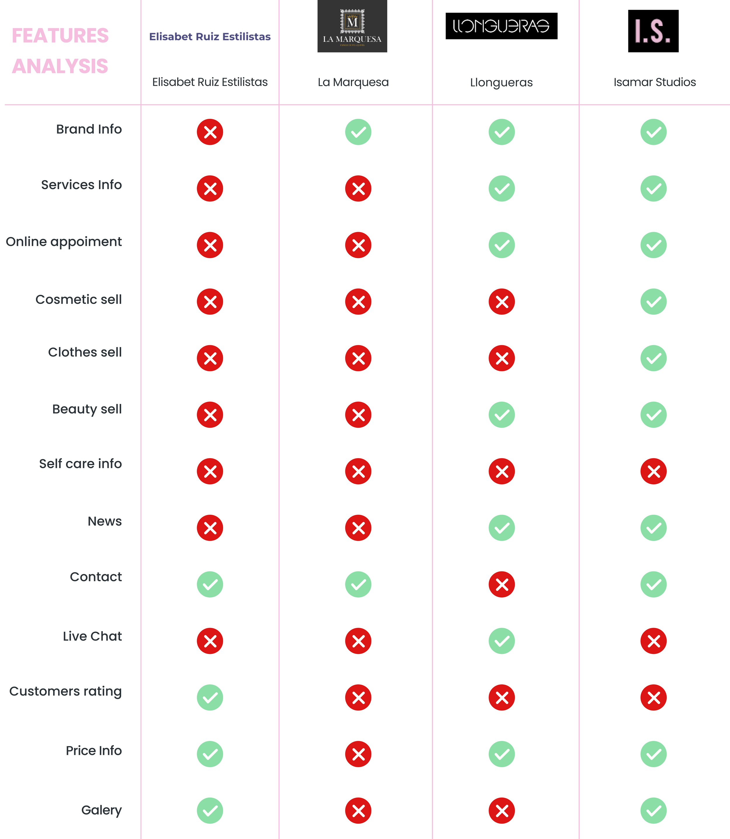
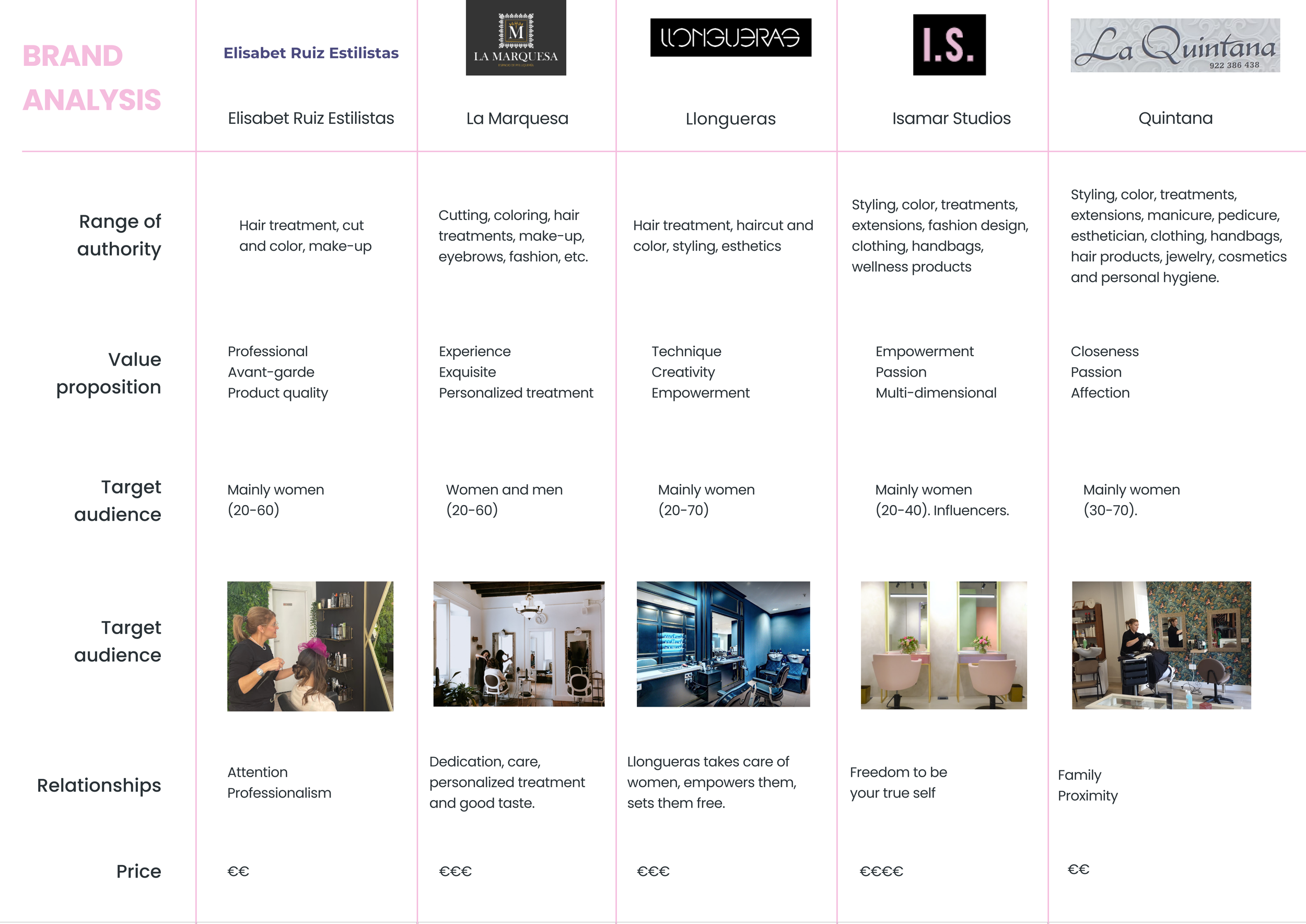
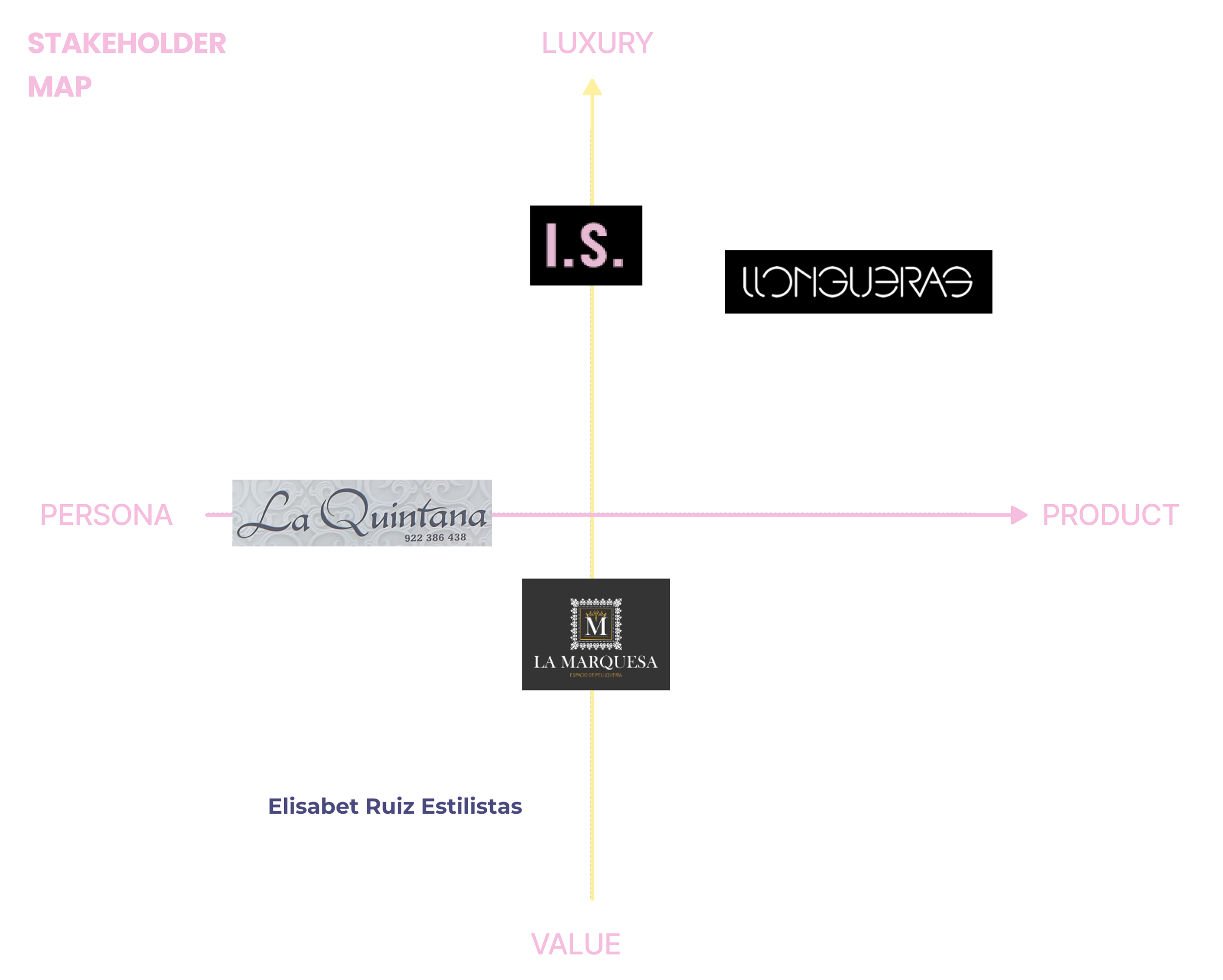
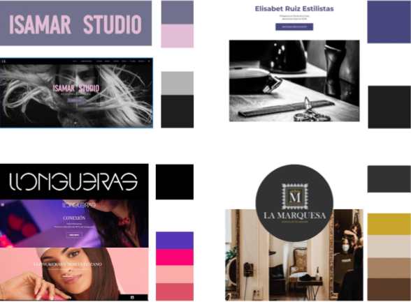
Competitive Analysis
Once we understood the business of our client, knowing the competition was crucial to know what it was being offered in the market so we ran a competitive analysis. We studied the competition based on the location, the services they offer and the type of business (local business or chain). As direct competitors, we analysed “Elisabet Ruiz Estilistas” and “La Marquesa” as they are also established in Tenerife and have similar clientele. In addition, we also analysed “Llongueras” and “Isamar Studios” for the high value they offer.
To study the competitors' services, values and target audience we used the following tools: Feature Comparison, Branding Comparison and Market Positioning Map.
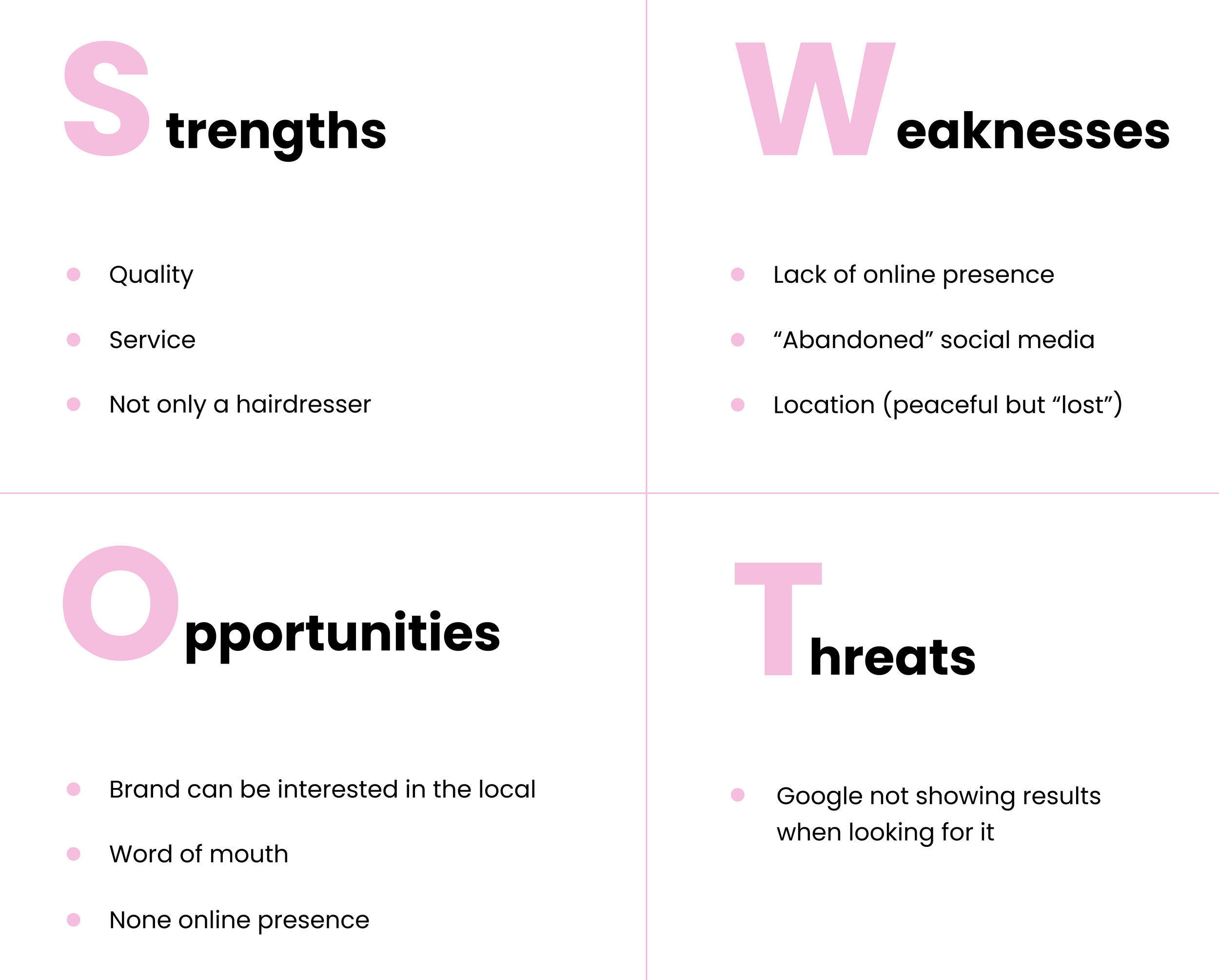
Lastly, after analysing the competition we run a SWOT Analysis to identify the strengths, weaknesses, opportunities and threats of our client.
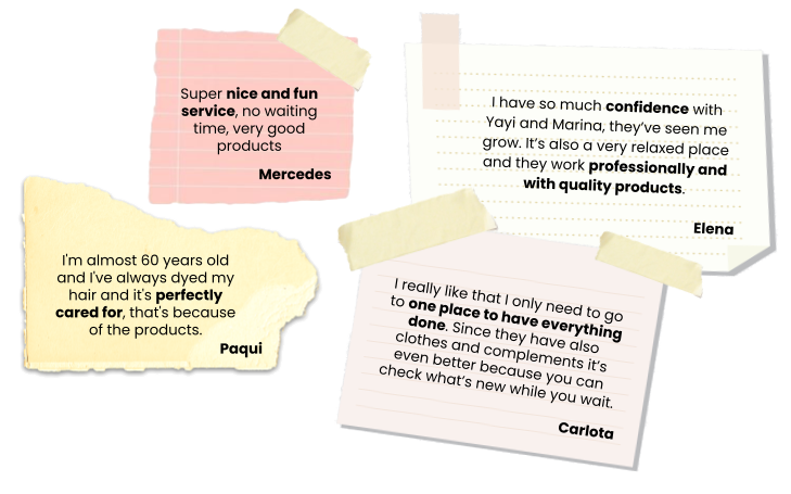
User Interview
At this point, having understood the business and the competition, it was time to interview the clients of the business, to know about their experiences, pain points and verify what we knew about the business. These are some of the things they told us:
Affinity Diagram & Empathy Map
With all these insights, we were able to build the Affinity Diagram to group them and vote for the most relevant ones.
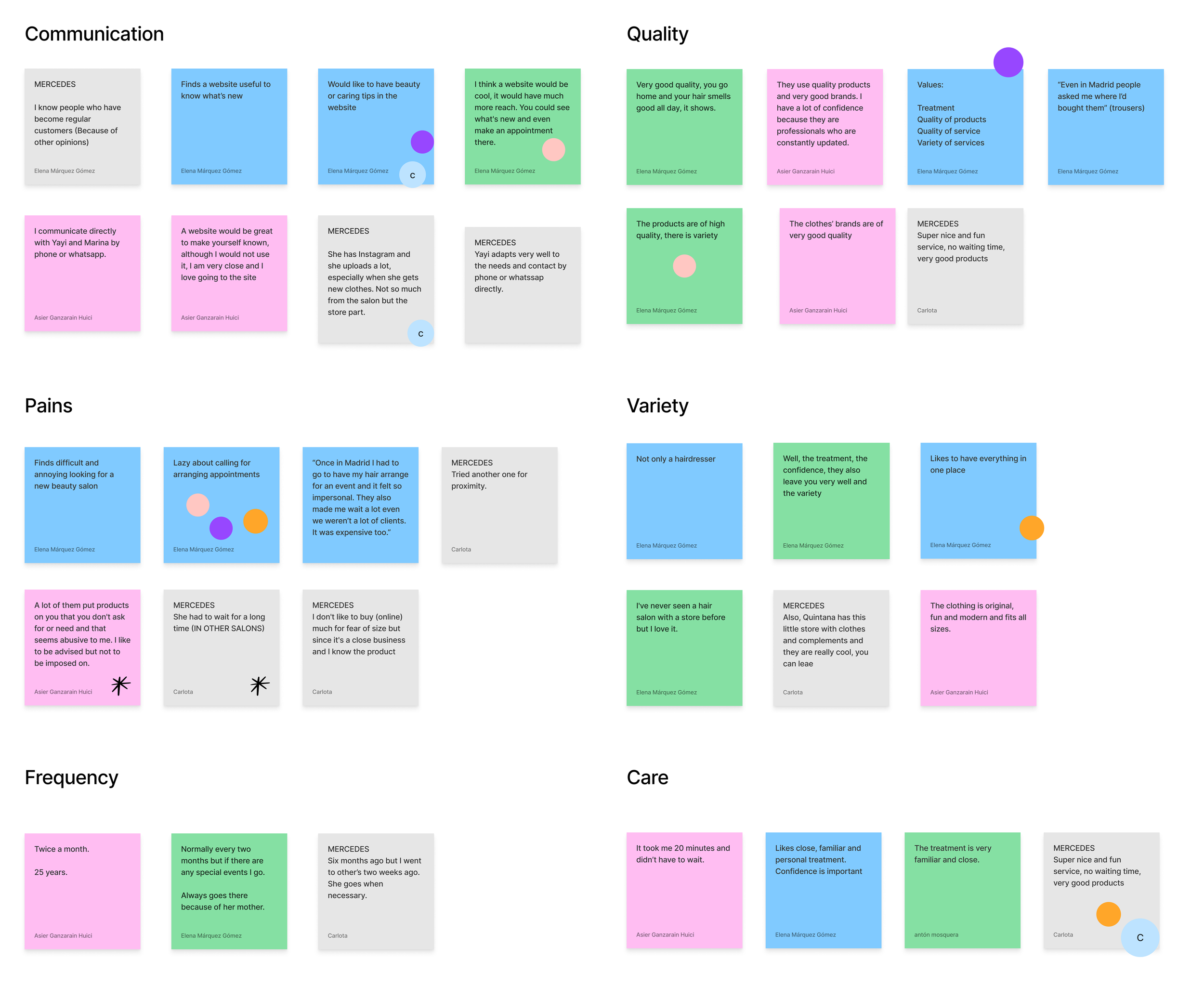
Then, gathering together all those insights into an Empathy Map, we were able to be in the shoes of the users to understand better the user’s goals, frustrations and thoughts.

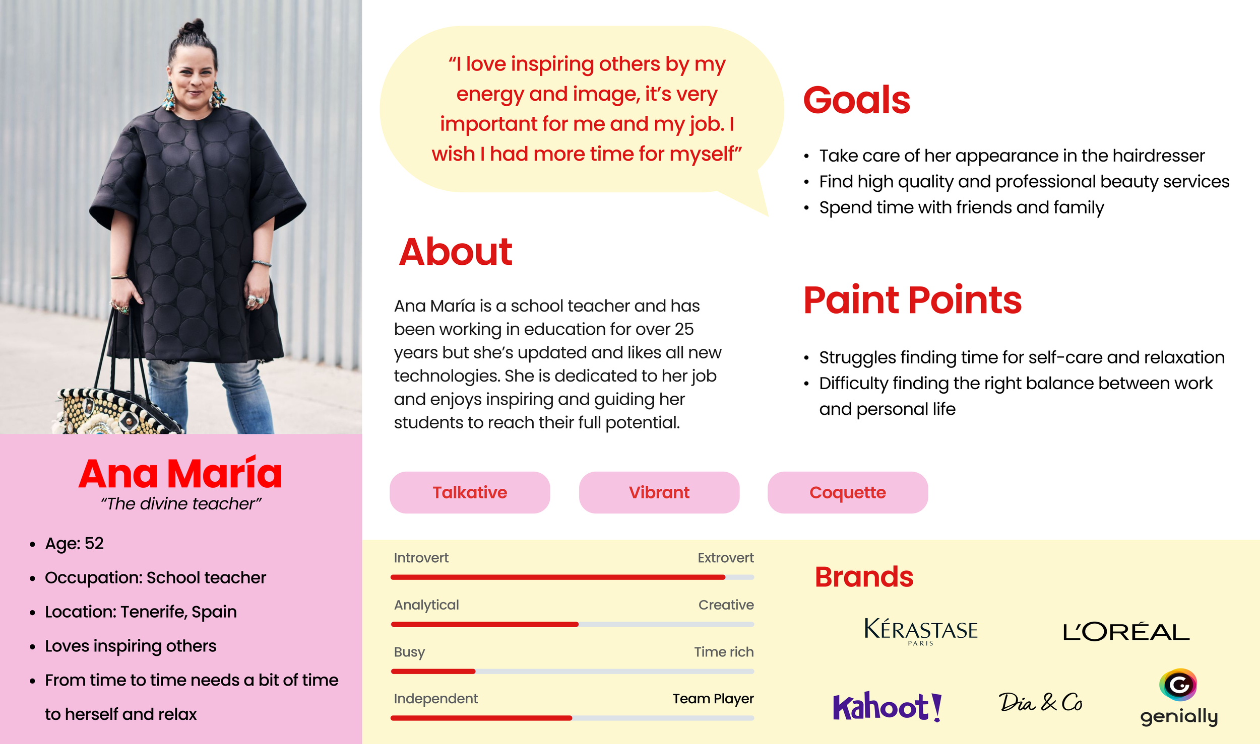
User Persona
After analysing the insights and empathising with the users, we were ready to create a user persona that could impersonate our main user group. Her name is Ana María the divine teacher. In summary, Ana María loves inspiring others with her energy and image in her job, but it takes a lot of her time and she would like to have more time for herself.
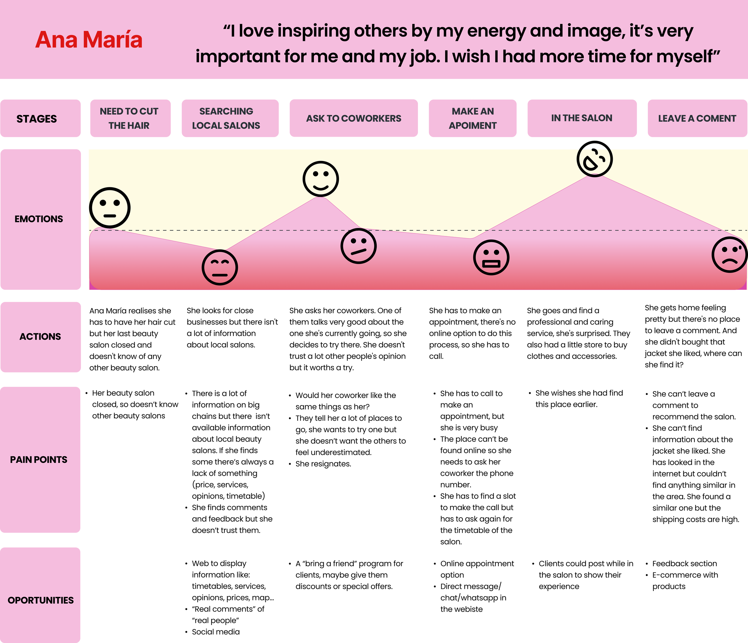
User Journey Map
With the user persona defined, we created a user journey map to see how Ana María could feel in a real situation. “She is new in town so she doesn’t know any beauty salons nearby, she searches for them on the internet but only finds chains. She asks her work colleagues and they recommend one but she would like to have more information. Even so, she is willing to try it, but she has to call the beauty salon to make an appointment but doesn’t have the time. In the end, she manages to make an appointment, and once there she is amazed by the service, and the treatment, they even sell clothes! After leaving the salon she wants to leave a review but there’s no website or app to do so, besides she wants to find that jacket she loves but doesn’t know where to find it.
Problem Statement
At this point, to define the problem, and solve Ana Maria’s pain points we defined some HMW statements:
HMW help a busy woman feel pretty and relaxed when she has no time?
HMW help a busy woman save time when going to the beauty salon?
HMW help a creative woman inspire others through her image?
As a result, we came up with the problem statement:
A modern-fashionist working woman wants to be empowered and treat herself because she doesn’t have time to balance work and personal care.
Ideation
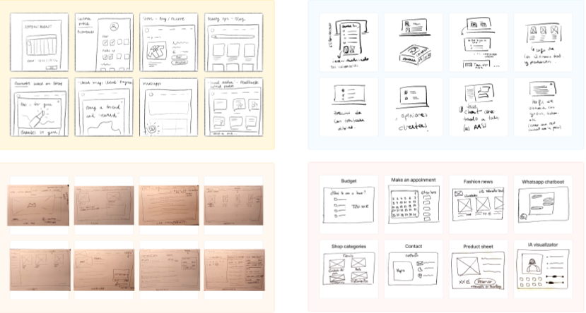
With the problem statement defined, we could start working on the solution. We started by using the crazy 8’s method to sketch out some ideas that could be included in our e-commerce.
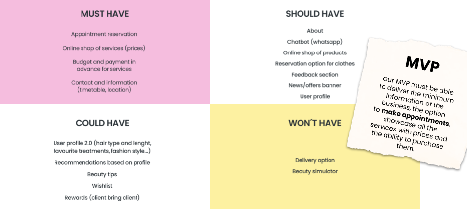
MOSCOW Method & MVP
From the crazy 8’s we came up with different features the e-commerce could have, so we applied the MOSCOW method to classify them between must-have, could-have, should-have and won’t-have. Once we decided on the features the e-commerce was going to have, we were able to define our Minimum Viable Product.
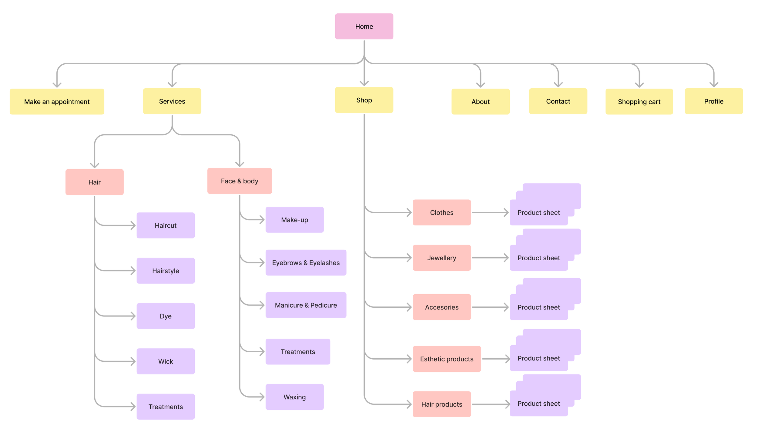
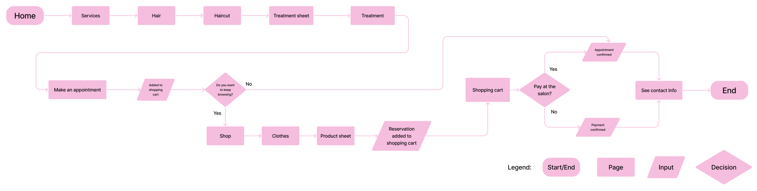
Sitemap & User Flow
With the MPV in mind, we could start building the website, but first, to stay organized, focused, and give structure to the website, we defined the sitemap, and the happy path by defining the User Flow.
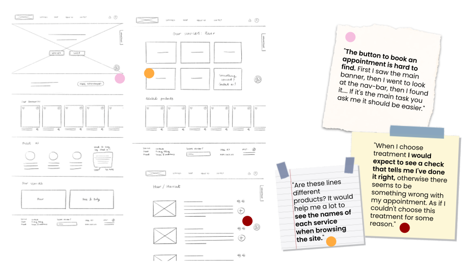
Low-Fidelity Prototype & Testing
At this point, we started creating low-fidelity wireframes in which we defined the basic structure of our website. Through testing, users started to help us polish some aspects like the header, the placement of the “make an appointment” button and the process of booking an appointment.
Mid-Fidelity Prototype & Testing
With the insights we got from the mid-fidelity, we started creating the mid-fidelity prototype in Figma. But first, before implementing any changes, we started creating components and component sets to save time and work.
One of the changes we implemented was to remove the option of adding services to appointments directly from services, as it was extremely confusing for the users.
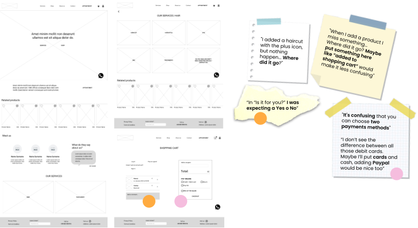
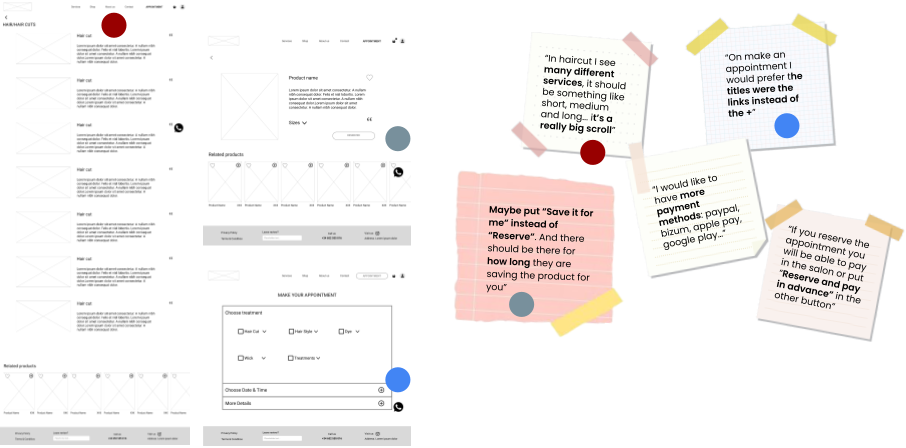
Testing the wireframes, we collected insights to implement in the high-fidelity prototype, which were divided into three categories:
Features: simplify the payment methods, rethink the service selection in making an appointment, and leave only the “book” option when making an appointment.
Content: highlight non-delivery information, enter the email after booking, add references for sizes…
Technical: select a proper format for the prototype and take out the double-click option on the buttons.
UI Part
Once we finished with the UX part, we were ready to start working on the visual aspect of the project. As we wanted to give a new image to the business, we come up with a new branding.
Visual Competitive Analysis
We started by looking at the visual style of the competitors to see how they communicate with their users. We noticed they use sophisticated, neutral and feminine palettes.
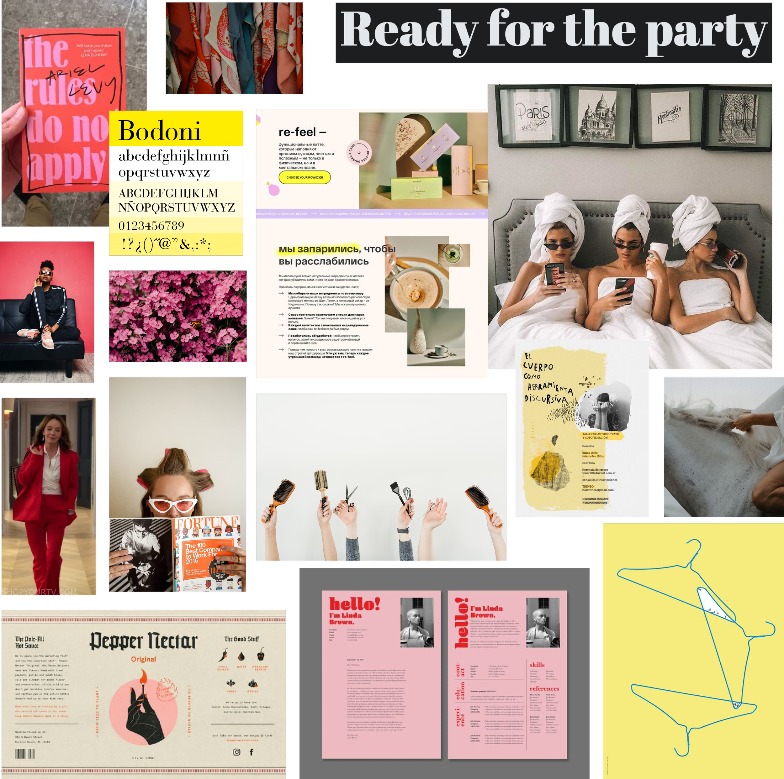
Brand Attributes & Moodboard
After meeting Yayi and her business, it was clear that Quintana wasn’t just another beauty salon. We wanted to take all the vibes and values of Yayi and bring them to the new brand image. These are the new brand attributes:
Spirited: in the sense of original and creative, making youth an attitude in life.
Reliable & hard-working: when you have 20 years of experience, know how to treat your clients and give excellent service, it should be reflected in the brand.
Glamorous & charming: in the feminine but empowering sense, our image allows us to express our personality.
Then we created a moodboard that reflected all these brand attributes. Bold, casual images with empowered people, typographies with personality and vivid colours.
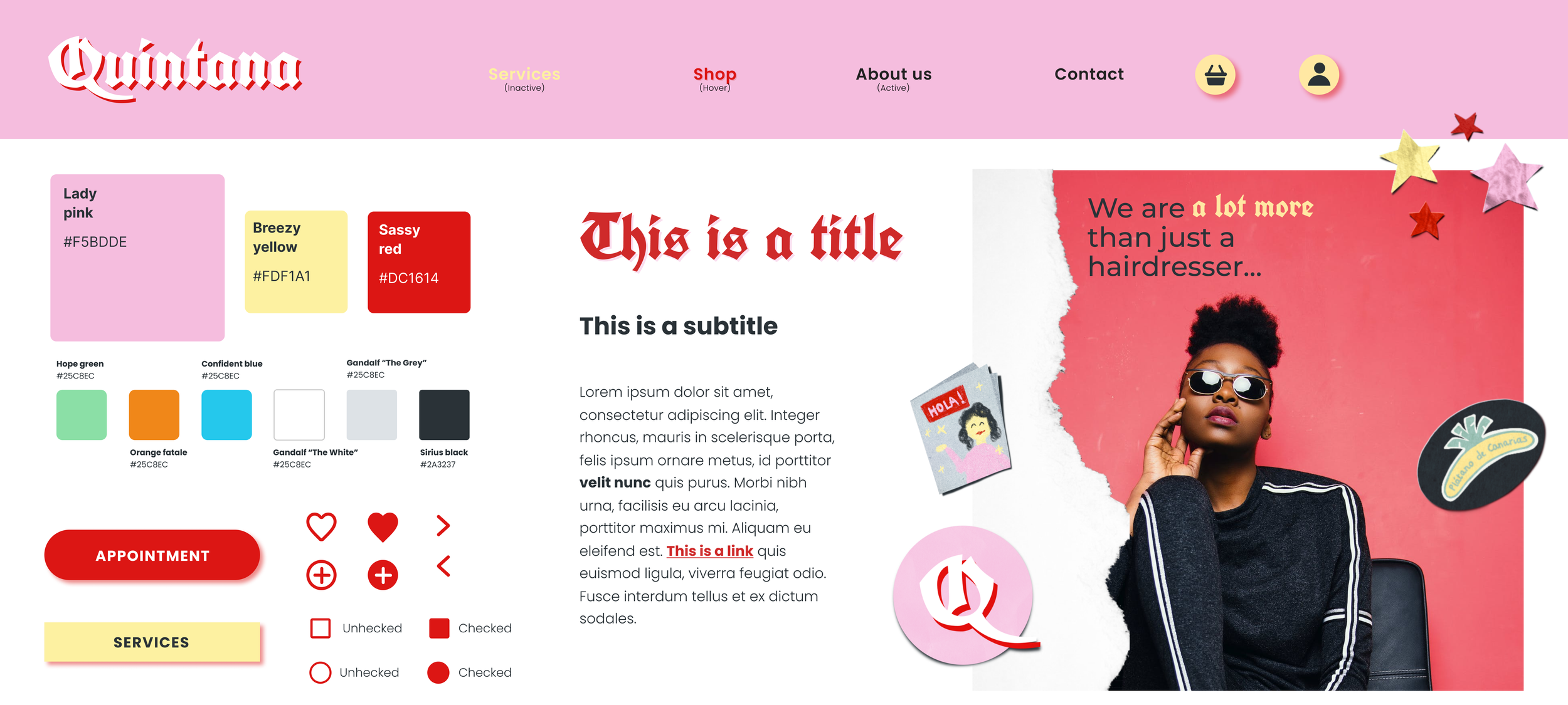
Style Tile
The next step was to create the brand image using the following elements:
Logo: we used “Unifraktur Cook” as our main typography which represents strength and rebellion. We combined the name, Quintana, with our main typography and two colours, so the idea of moving away from conventionalism is reinforced.
Colours: we used a palette of analogues with a pump in red, which we will use in buttons and elements to highlight. Pink and yellow give a soft and feminine tone, but red adds a disruptive touch to the whole. It is said that pink and red don’t match, but with Quintana, we wanted to break all the beauty canons. We also relied on a series of semantic colours to help the users in the different processes.
Typography: as said before, as the main typography, we used “Unifraktur Cook”, and as the secondary, we used “Poppins”, a friendly and simple typography.
Icons and images: we looked for simple lines icons, bold images, stickers and torn paper to break away from typical compositions and straight lines.
We applied all these elements to the homepage and had the opportunity to receive feedback, we received positive feedback and that our Style Tyle match the brand attributes, so we were on a good path.
While we were creating the high-fidelity prototype we had the opportunity to test it and we were said to minimise the use of red in links and icons, relaying more in our semantic colours, to make more evident the out-of-stock products and airing more the buttons to improve the readability.
High-Fidelity Prototype
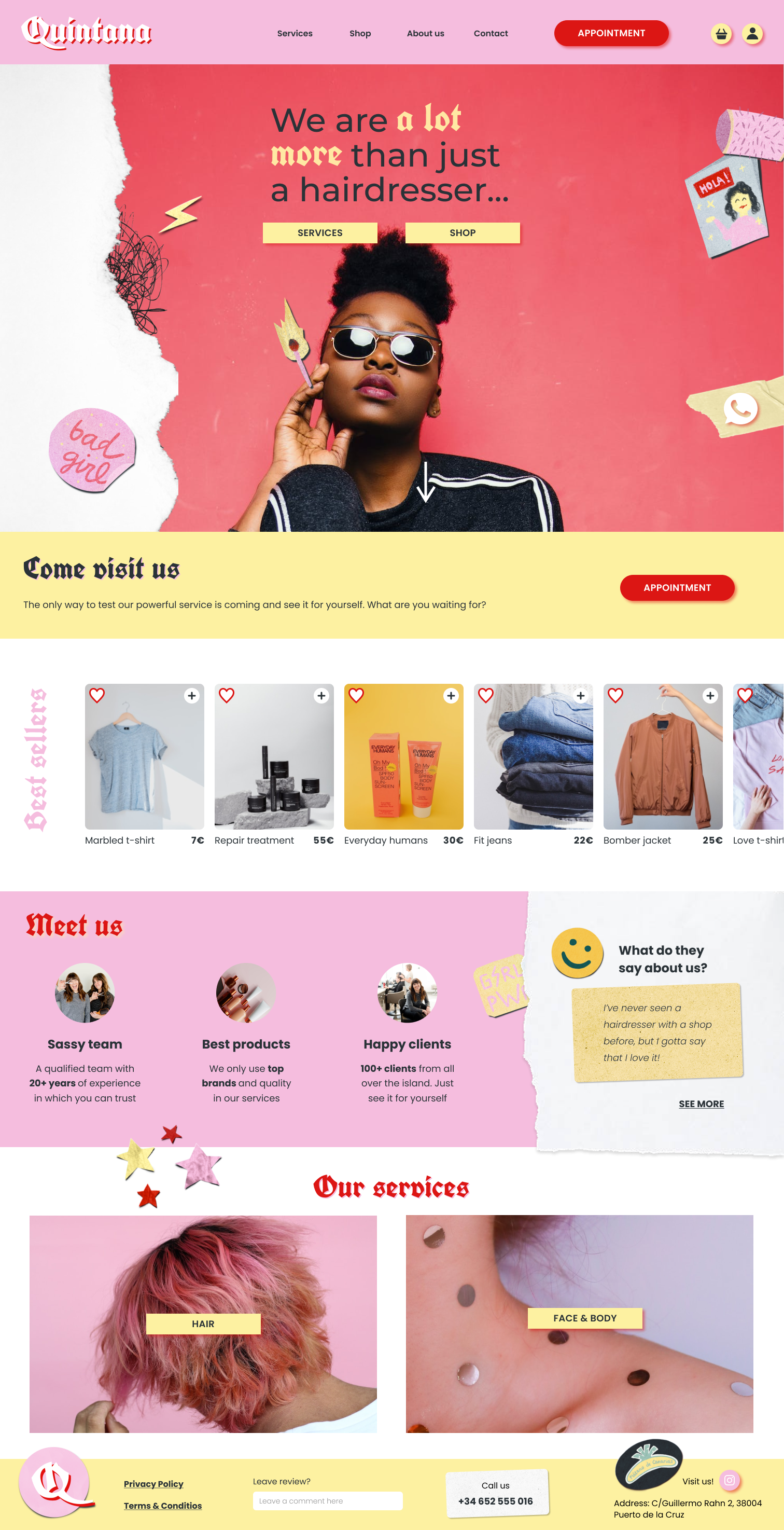
Thanks to all the feedback collected throughout the whole process, we were able to create Quintana’s web presence. The desktop version following the happy path is the next:
Homepage: it is divided into different rows. The header has the logo and the main actions. We wanted the “Appointment” button to be always present on all the pages, as well as the WhatsApp chatboot, highlighting the direct communication with the business. The banner takes us to the main services of the website, then we find best sellers, business information and feedback from customers, something very important for this type of website. The footer includes a reduced version of the logo, and the option to leave feedback and contact info.
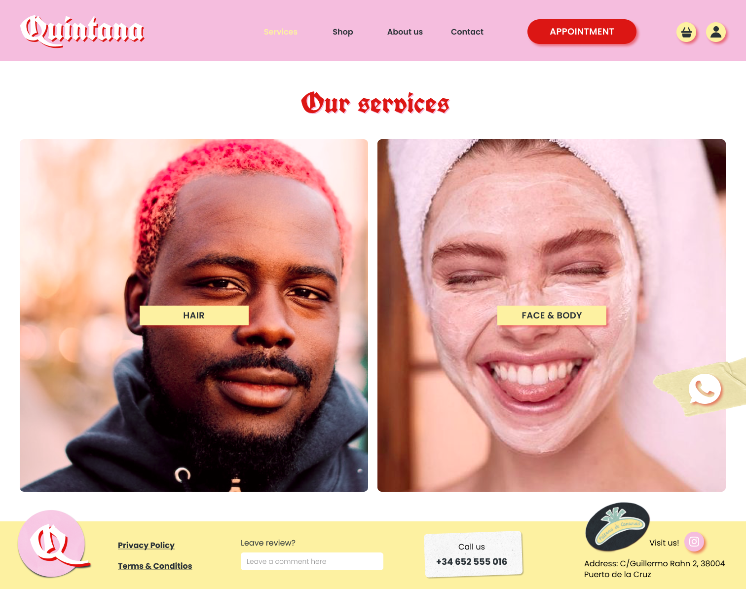
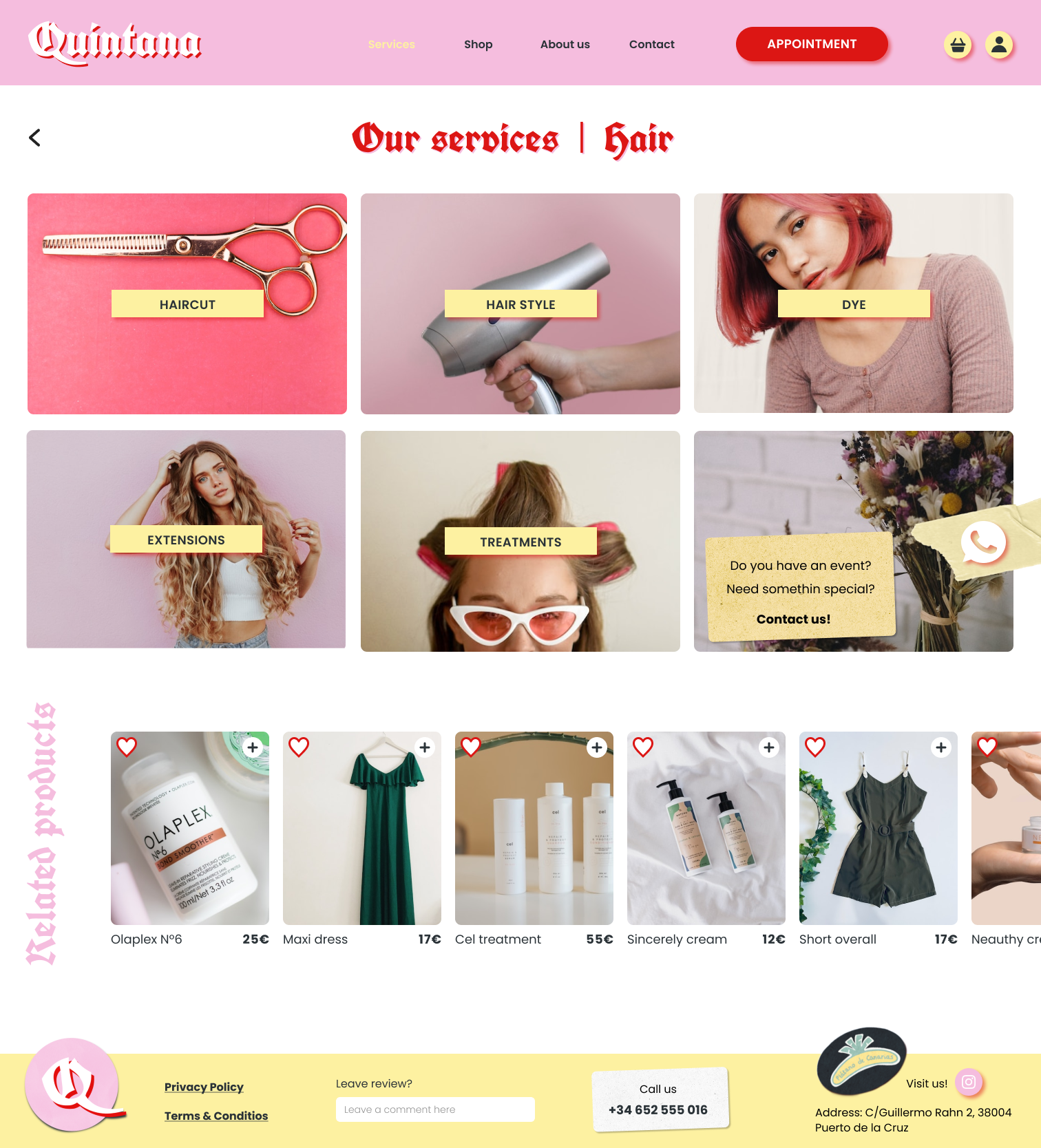
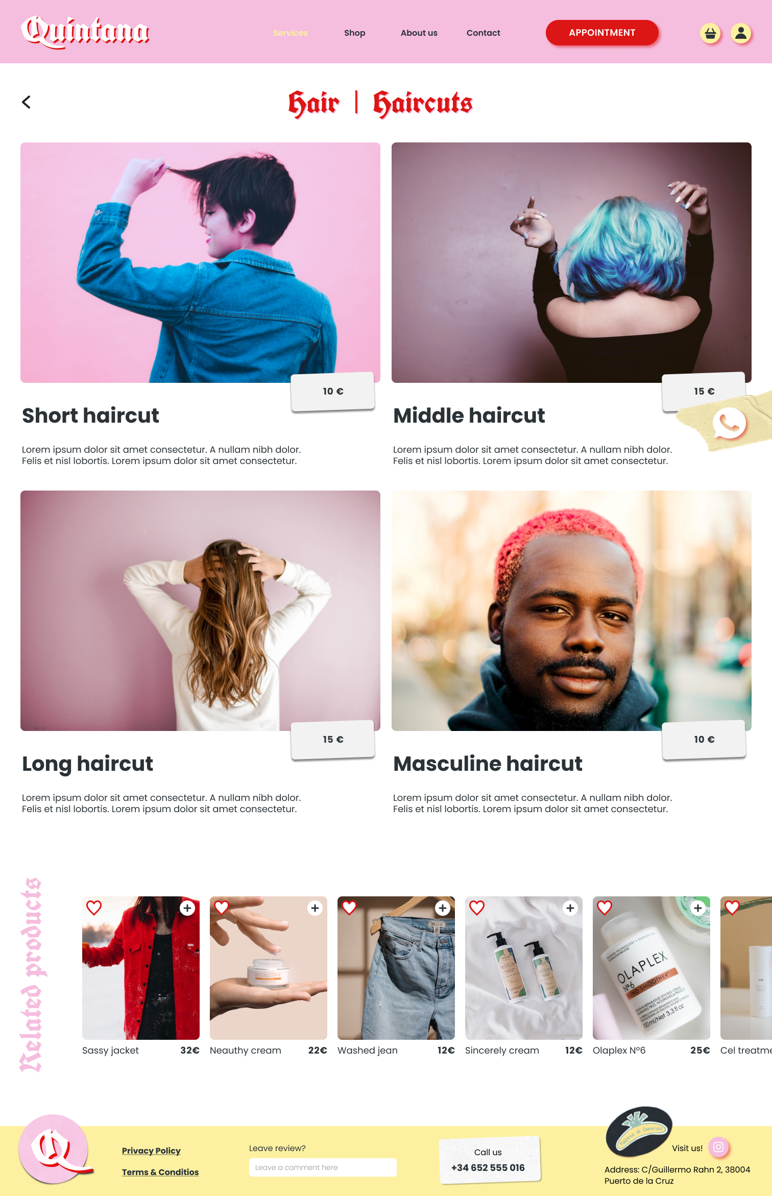
Services/Subservices: we want to get a haircut, so will go to services, there we will find two large categories, so let's check hair services. we can see the different services that are offered, always supported by images. Finally, we find we find the haircut we want, with a small description and the price. Also, we showcase related products of the service.
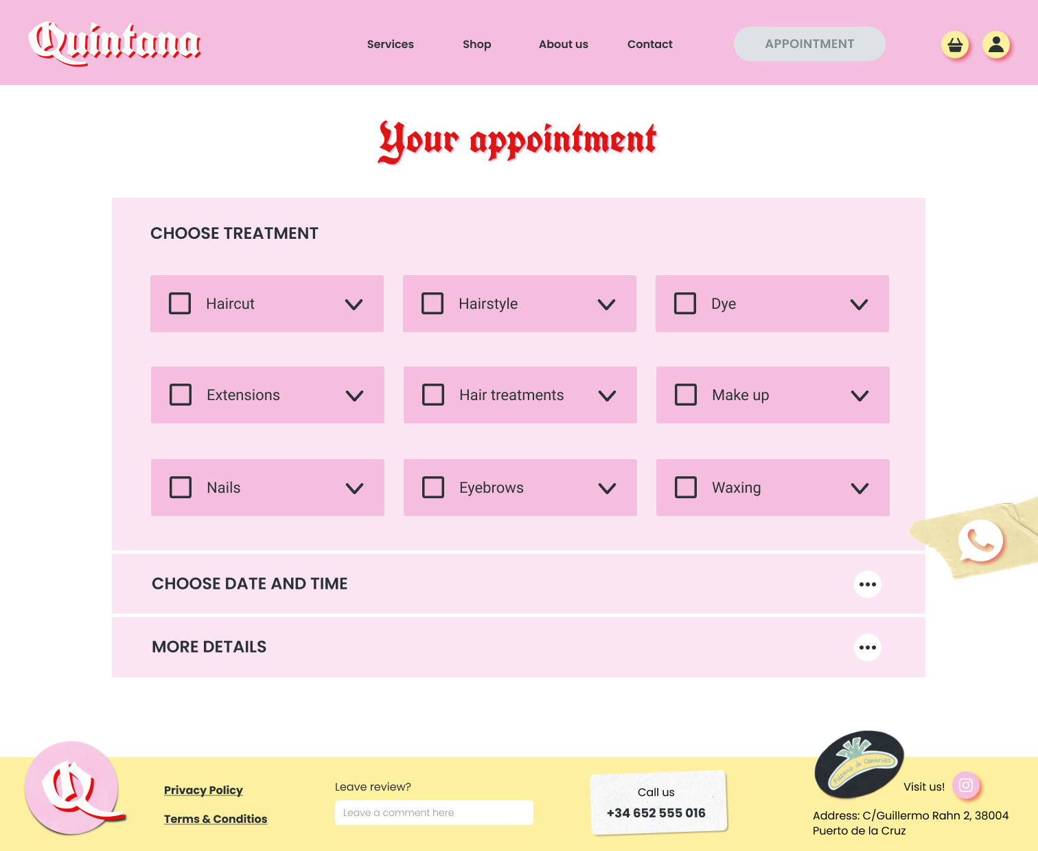
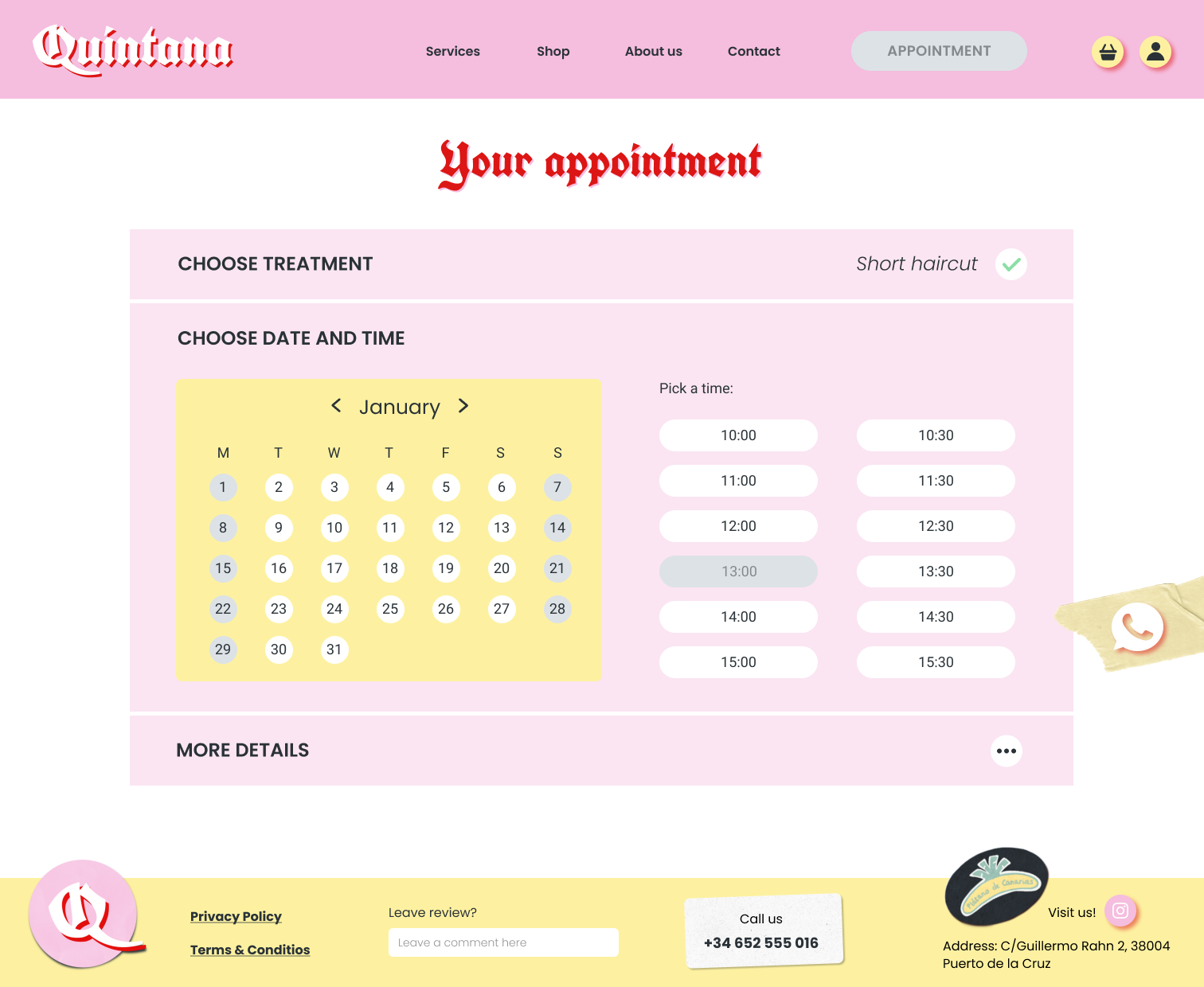
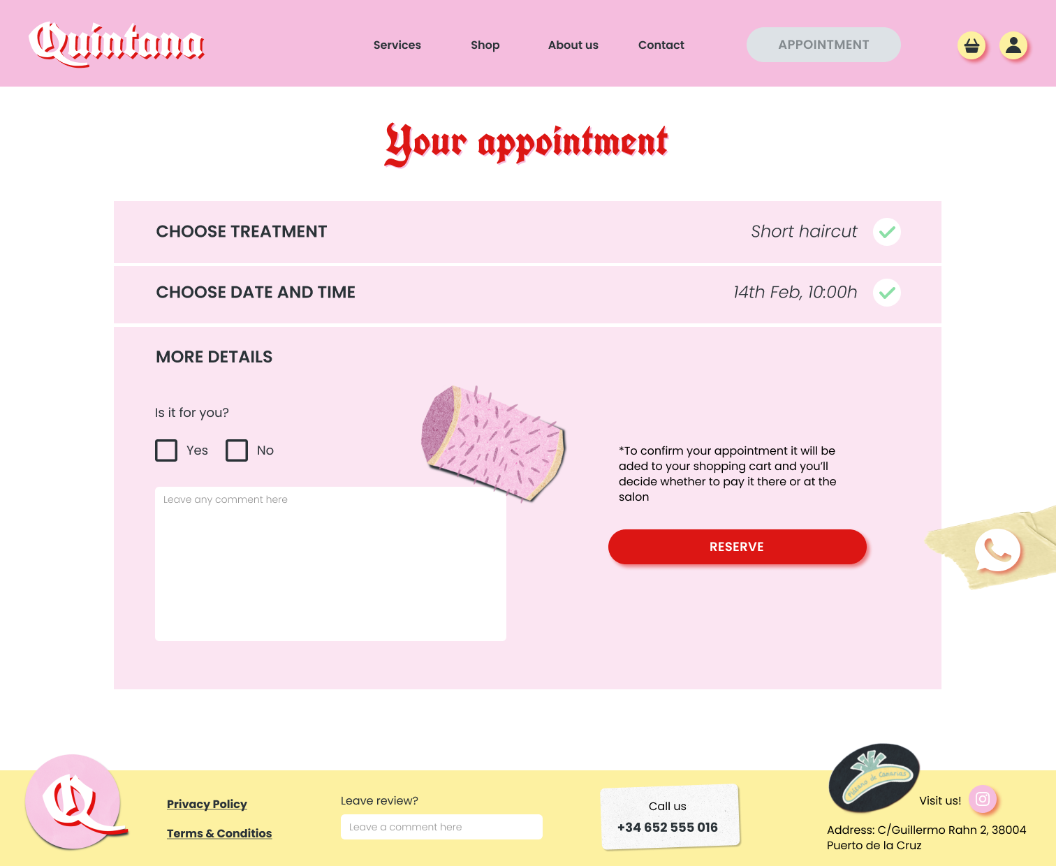
Making the appointment: now that we are clear about what we want, we book an appointment. We select the service, the day and the time. We mark the checkboxes and a small summary of our appointment appears. In more details, we can include comments, and we are notified that the appointment will be added to the shopping cart. Let’s book it then. We have a pop-up to go directly to the shopping cart or go to the shop.
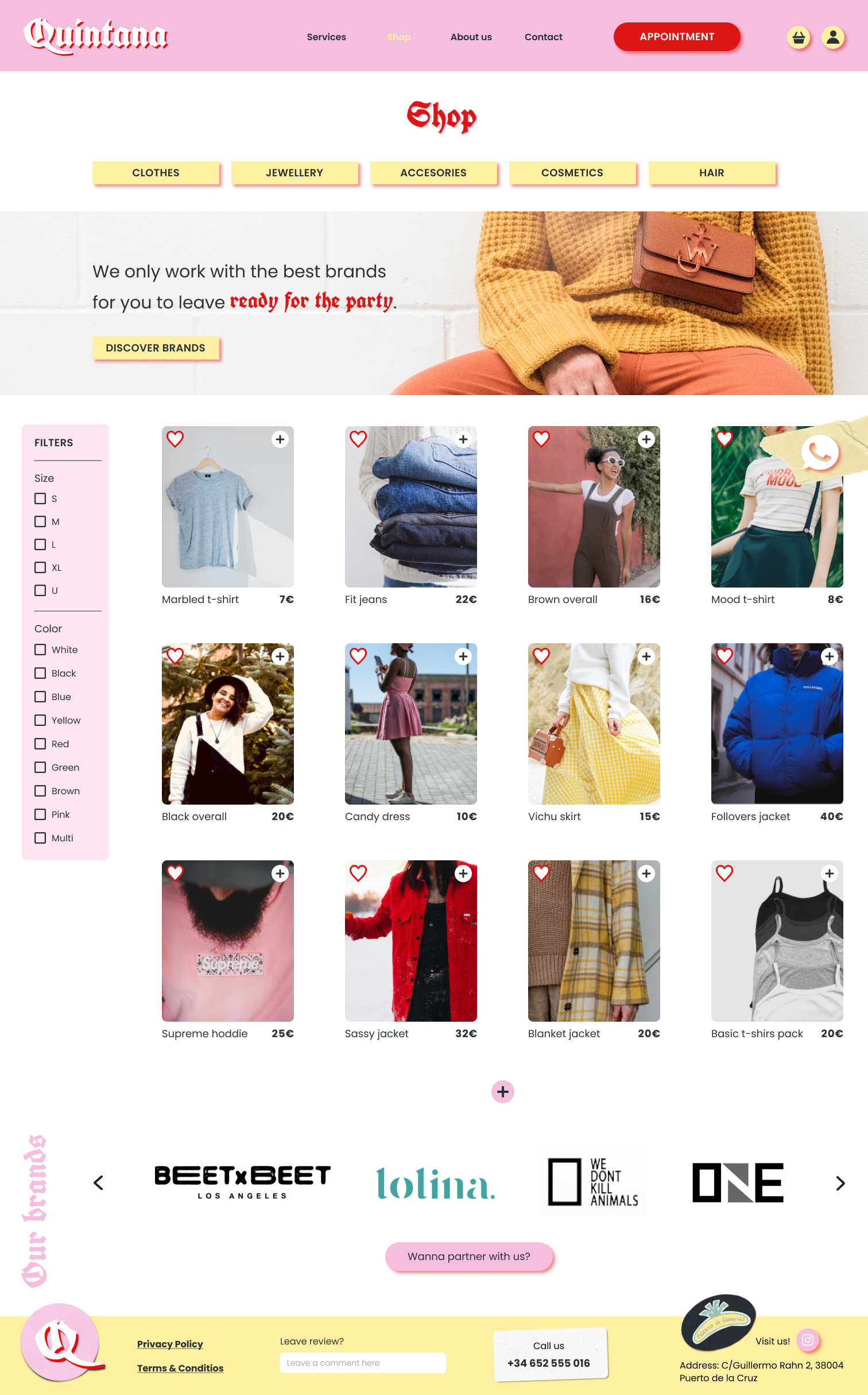
Shop: the shop allows us to browse product categories and apply filters. We can easily add products to the favourites list and the shopping cart. Ohh, I love this jacket, let's have a look at it.
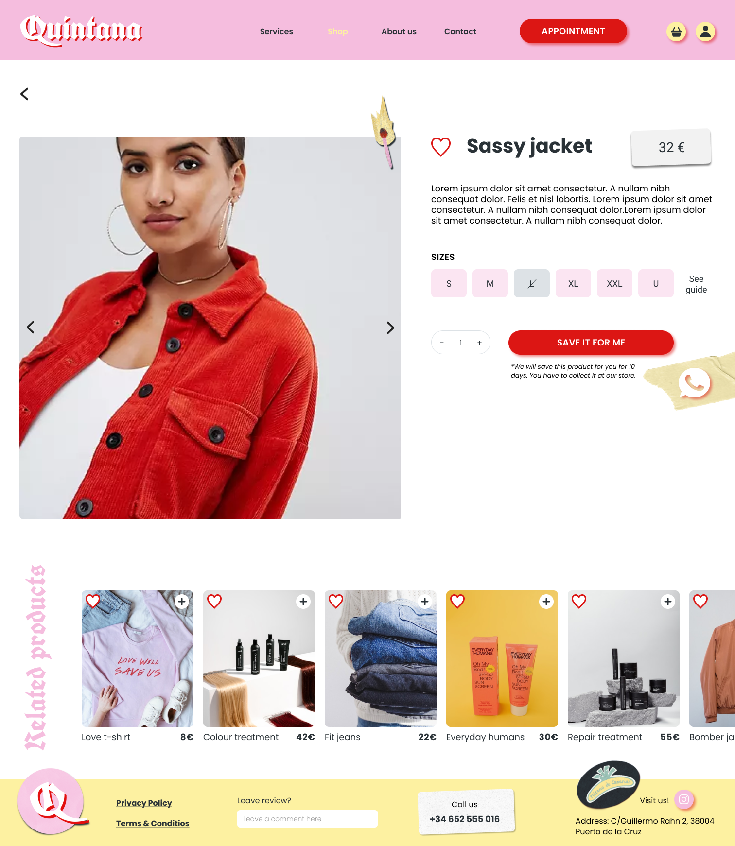
Product page: now we can see the basic information about the jacket, its price, available sizes and select quantities. Notice that we are warned that there is no delivery option, as it is a product to be picked up at the salon, so we can try it on there. Let's reserve it!
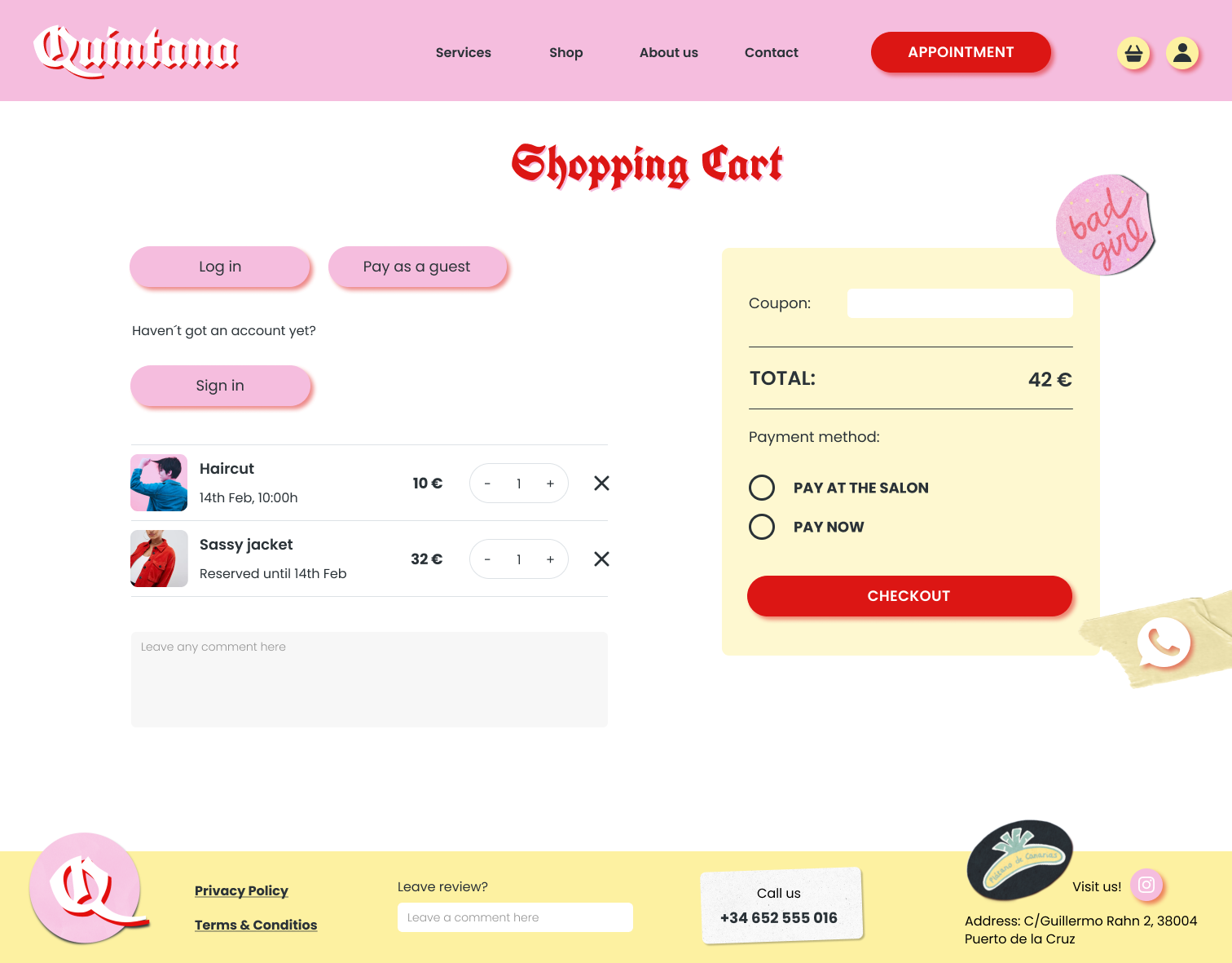
Shopping cart: in the shopping cart we have several options to log in, and the summary of our order where we can see prices and the option to edit the services or products. Here where we can choose to pay at the beauty salon or leave it already paid. Let’s go for it. Confirmed! But how do we get to Quintana? Oh, I think we should check the contact page.
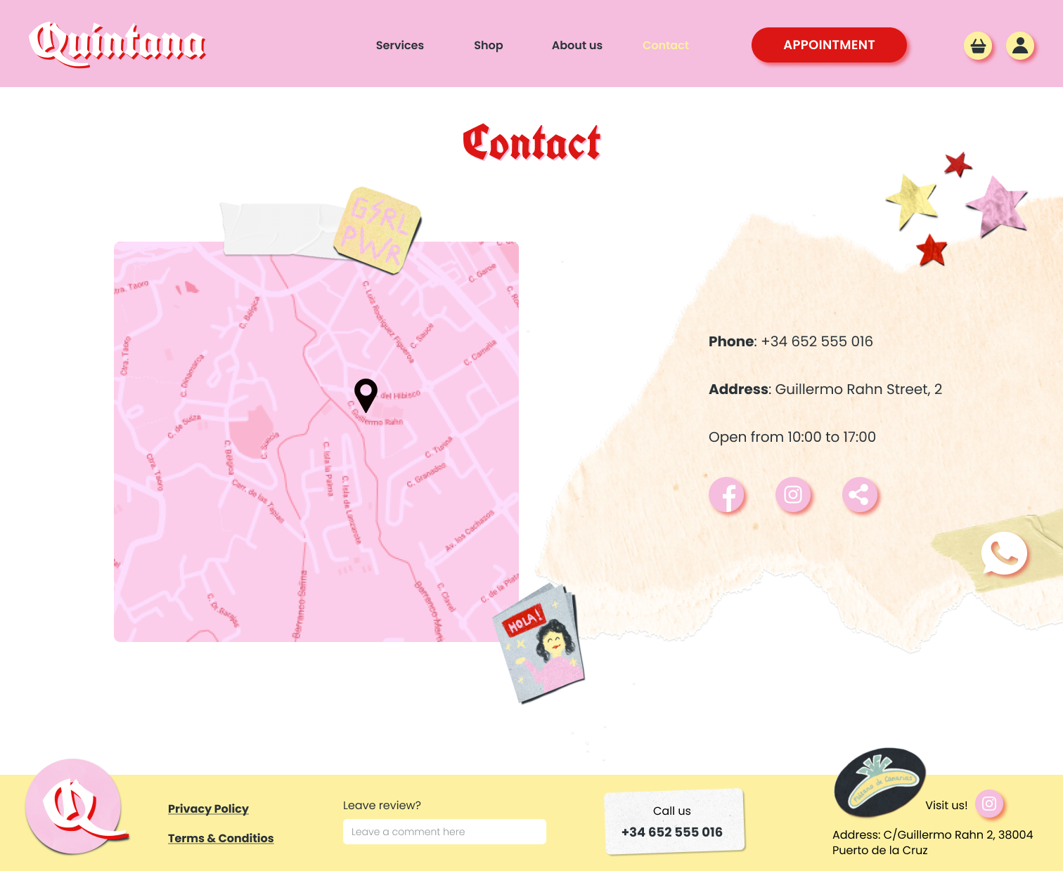
Contact: here we can see how to get to Quintana, opening hours, contact information and links to social networks.
Click here if you want to play with the prototype and see all the features.
Responsive Design
Simplifying the header for smaller sizes and using columns for our design, we adapted the homepage to mobile and tablet.
Click here if you want to see the mobile version
Click here if you want to see the tablet version
Next steps
This is where we have reached this project, and these are the next steps:
Implement changes from the last testing sessions and keep testing.
Add more features such as the user profile, and the development of the blog to see beauty tips and related articles.
Take the brand to social networks and reinforce its presence.
Learnings
It has been a very interesting project to work on and we have learned a lot of interesting tools and tips. These are some of the learnings:
As a group, we have learnt to take decisions based on research and feedback. We have designed everything with the users in mind, testing step-by-step with them not to lose focus.
Working with a real customer in mind, taking their needs, goals and frustrations into account, to deliver the best possible solutions.
The importance of using components, component sets and auto layouts in Figma to save a lot of time and hard work.