
2023

Meditation app design | Droplett

Project Overview
Meditation app design to promote mental health and wellness by offering a variety of guided meditation sessions and a fun way to enhance the meditation experience.
Roles
UX/UI Designer

3-person collaborative project
Figma | Google Forms

Set up
The client
The Daily Health Conference is a non-profit organization promoting health and wellness through impactful public talks, participatory workshops, and professional training worldwide.
Challenge
The Daily Health Conference wants to find a way to offer more value to its members. They want designers to conduct user research to understand people’s relationships with mental, physical, and emotional well-being. Designers must design a prototype for a tool that will motivate clients to take action.
Requirements
The app can address any aspect of personal well-being, including (but not limited to): medicine, fitness, nutrition, meditation, time management, and so on.
The app should monitor the users’ progress and encourages them to adopt a healthier lifestyle.
Users must retain control over their data (GDPR Compliance).
The user interface should reflect a new, fresh, updated image aligned with the Daily Health Conference values.
In this case, it has been chosen to design a meditation app for mental health and wellness.
Agenda
UX Part
Secondary Research
Competitive Analysis
Surveys
User Interview
Affinity Diagram & Empathy Map
User Persona
User Journey Map
Problem Statement
Ideation & Crazy 8’s
MOSCOW Method & MVP
User Flow
Low-Fidelity Prototype & Testing
Mid-Fidelity Prototype & Testing
UI Part
Visual Competitive Analysis
Brand Attributes & Moodboard
Style Tile
High-Fidelity components
High-Fidelity Prototype
States
Next steps & Learning
UX Part
We have to start by understanding the context, what are the goals, the pain points and the frustrations of people who usually meditate, and what they think about meditation apps.
Secondary Research
After reading some articles and search statistics about meditation, we learnt some interesting things about the topic:
What is meditation?
Meditation is the practice of deepening one’s awareness or focusing one’s mind for some time. It has religious and spiritual roots in cultures all around the world.
Meditation benefits:
Increase self-awareness.
Mitigate the effects of stress.
Positively affects the immune system.
Improves attention span and concentration.
It is useful to empathize with others.
Increase pain tolerance.
Improves memory and cognitive functions.
Enhances the appearance of positive thoughts.
General meditation statistics:
200–500 million people meditate globally
Women meditate twice more than men.
People between 45 and 64 years old meditate the most.
The main benefit of meditation is that people who meditate can reduce coronary heart disease by 87%.
52% of employers offer meditation as part of the benefits package.
There are a lot of types of meditation such as mindfulness meditation, concentration meditation, mantra meditation, guided meditation, vipassana meditation and so on.
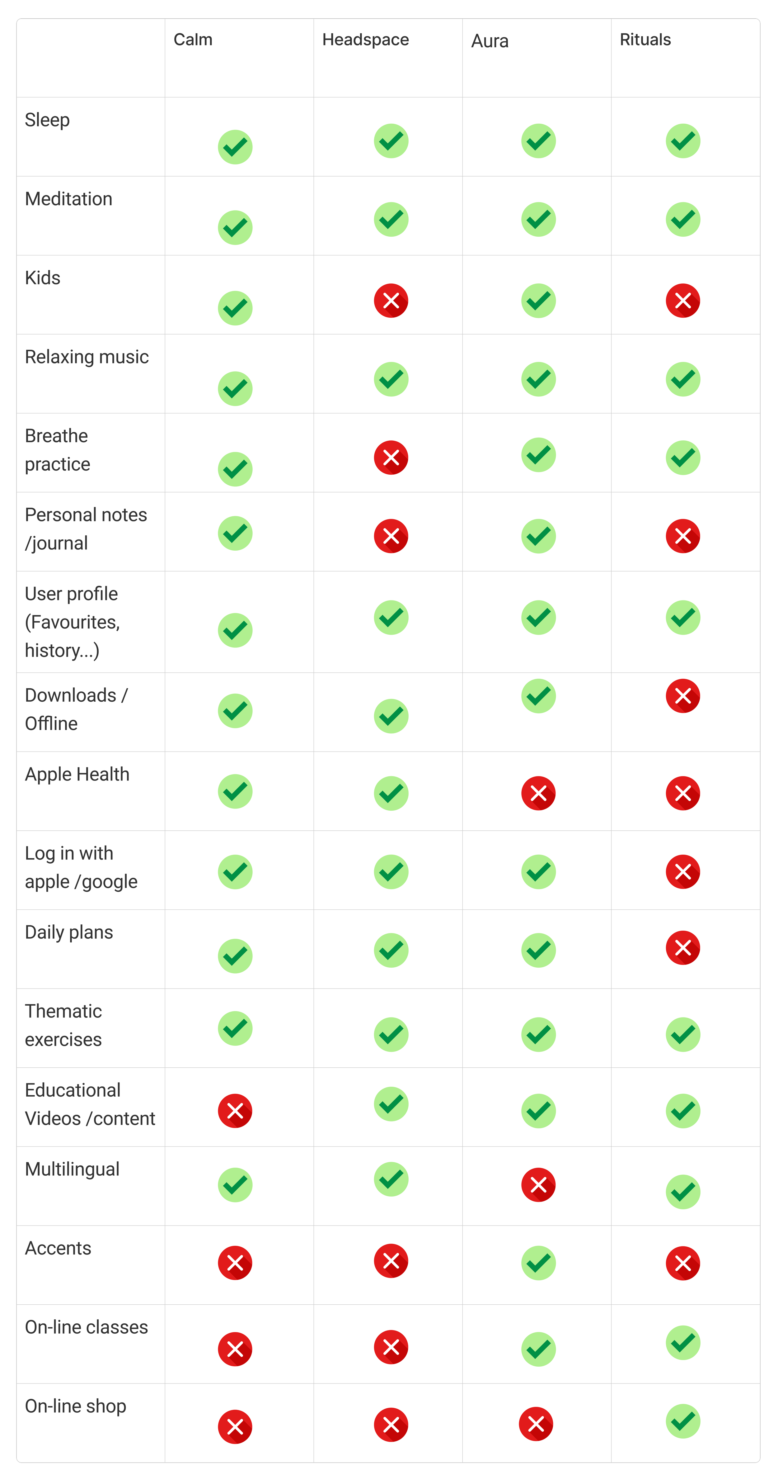
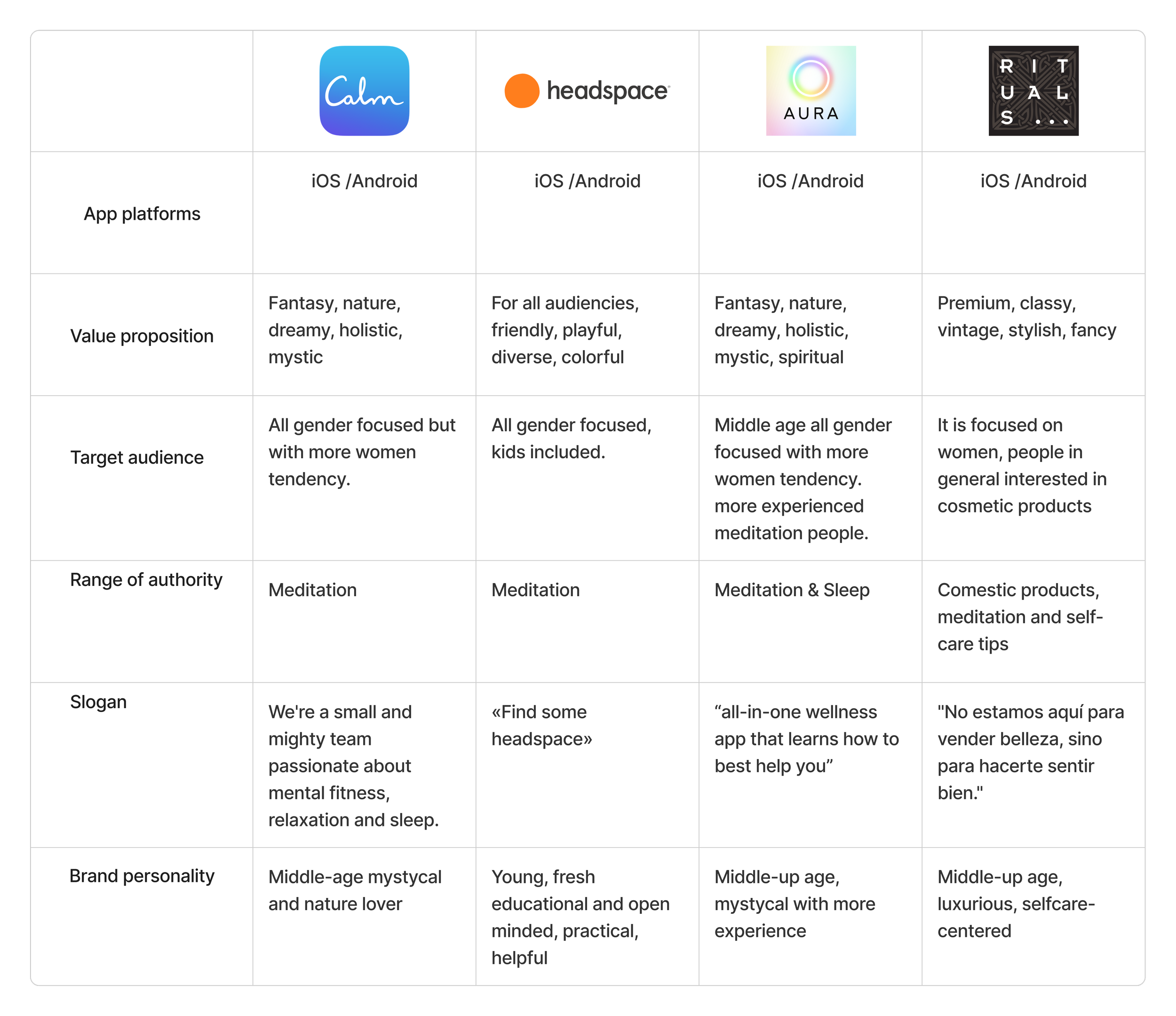
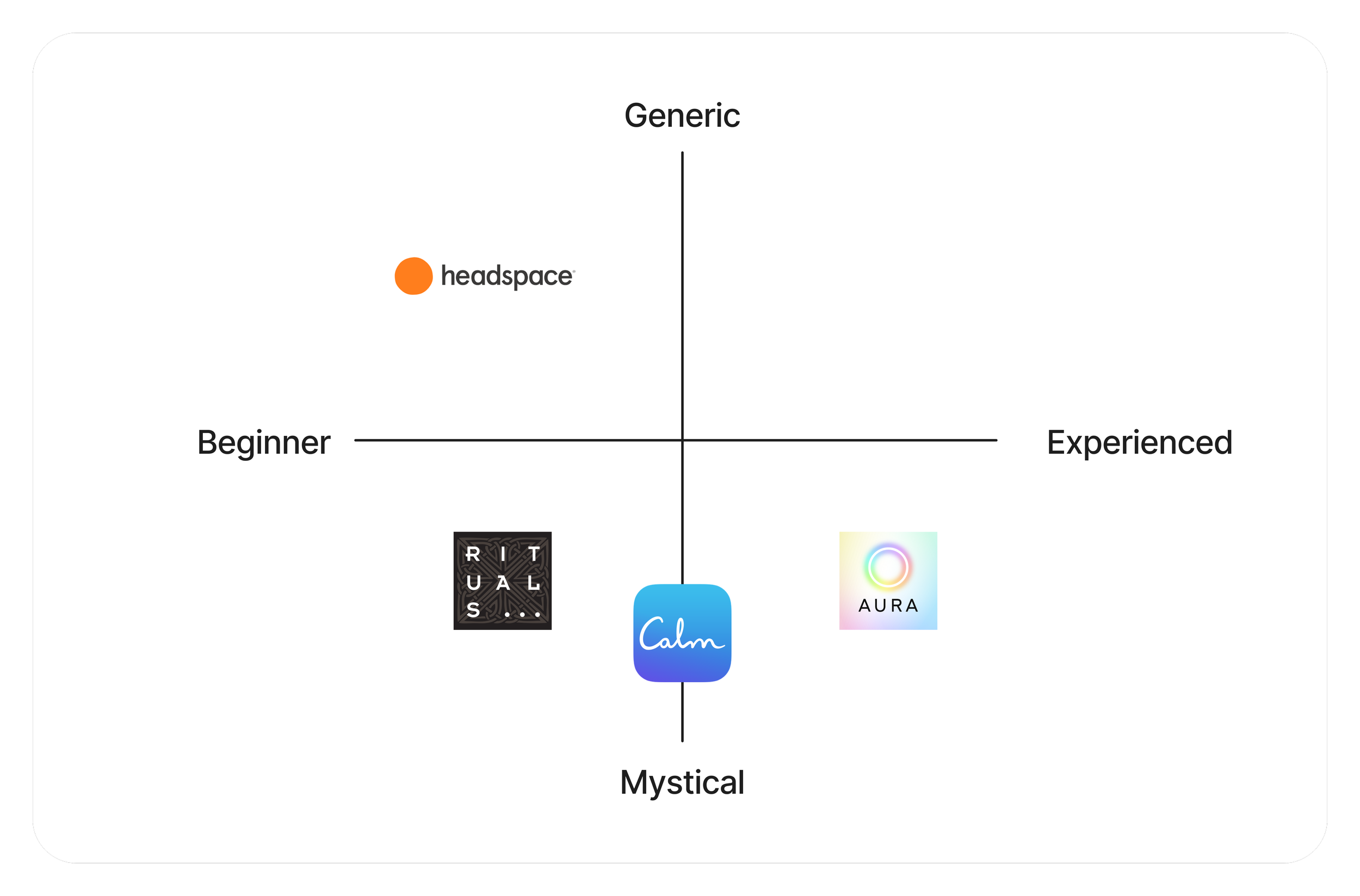
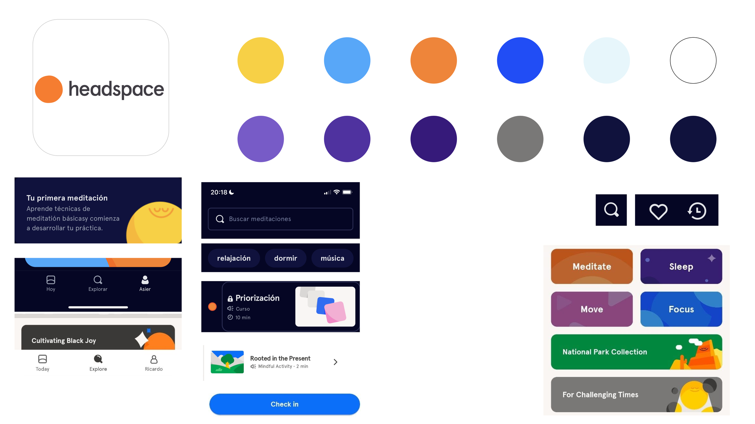
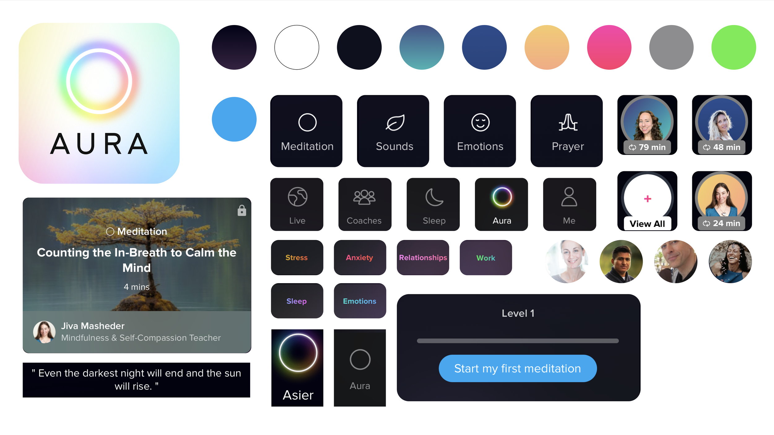
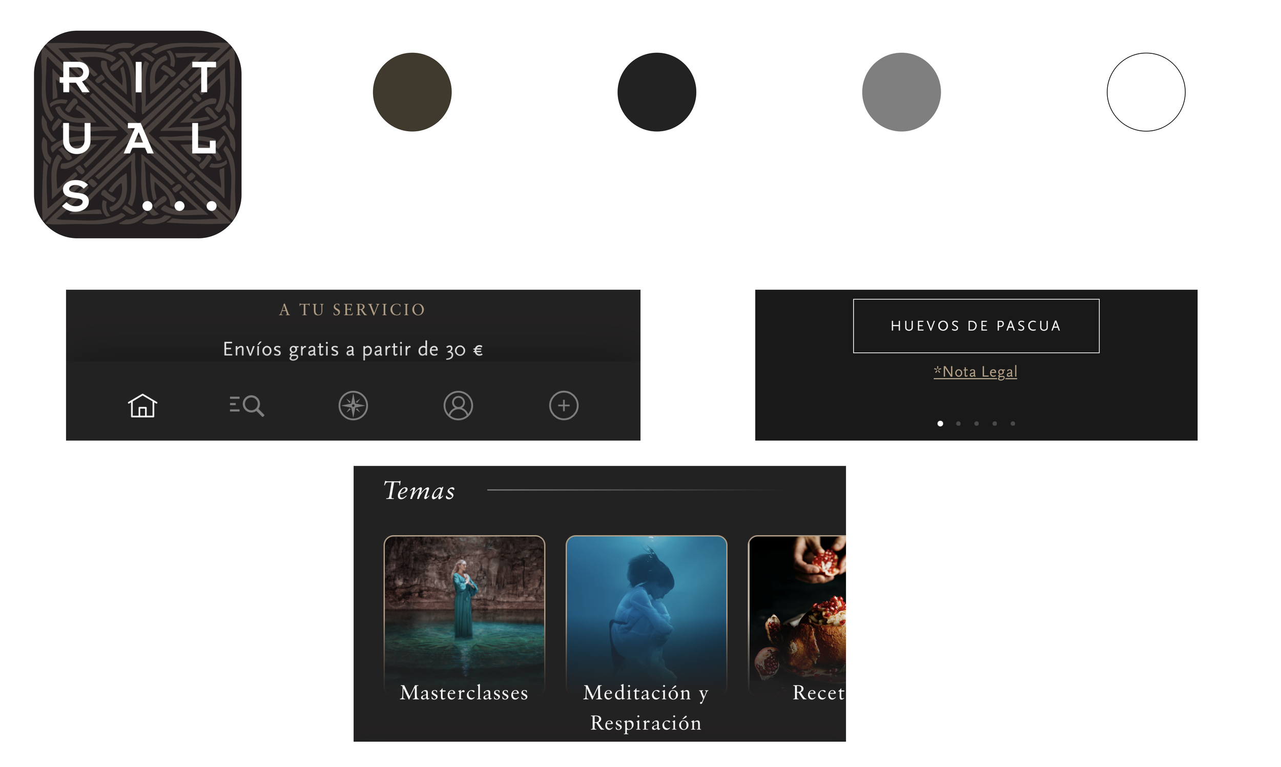
Competitive Analysis
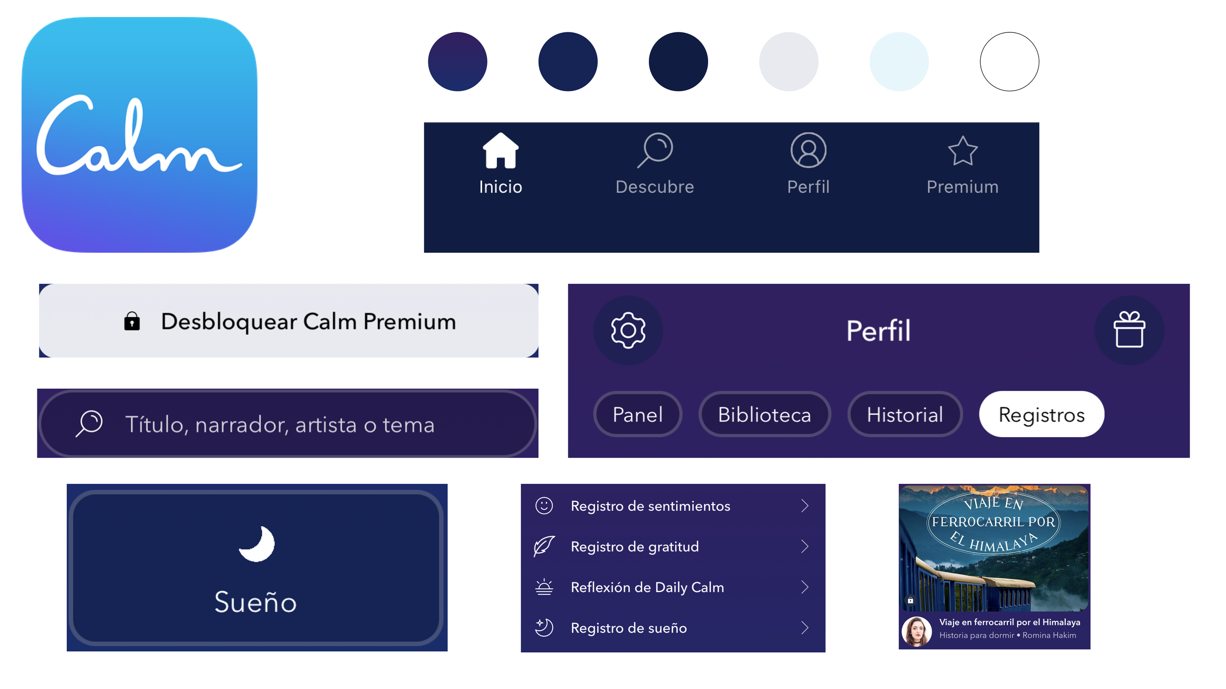
Once we understood the context, before jumping to know the goals, the pain points and the frustrations of the users, we need to understand the competition and what they offer in the market, so we run a competitive analysis. We focused on the competitors who offer a meditation app service, so we analysed Calm, Headspace and Aura. We also analysed Rituals, a cosmetics shop, as it offers meditation tips and guides on its app.
To study the competitor's services, values and target audience we used the following tools: Feature Comparison, Branding Comparison and Market Positioning Map.
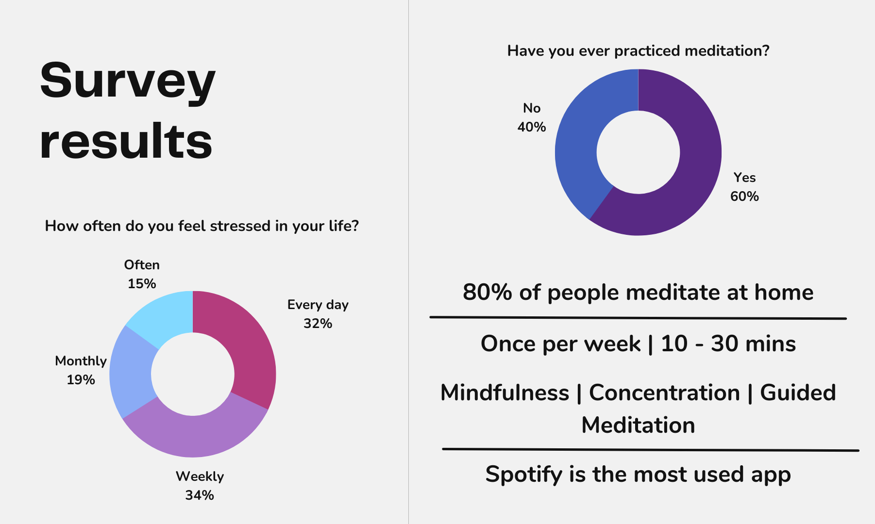
Surveys
With all this data, we need to gather information from users, so first we run a survey to collect quantitative data. They were asked questions like “How often do you feel stressed in your life?”, “Have you ever practised meditation?”, “Where do you meditate?”, “How often do you meditate?”, and so on. As a summary, the next data was collected:
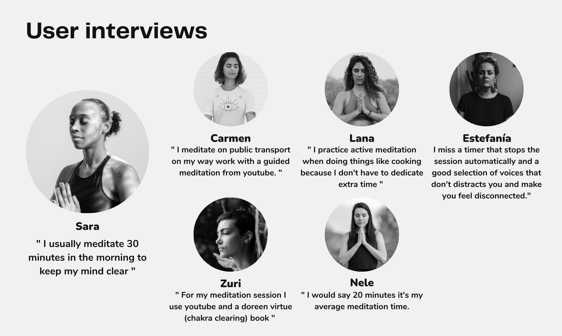
User Interviews
At this moment, it was time to interview some of the users to learn even more about their goals, their pain points and their frustrations, and verify what we learnt from the surveys. These are some of the things they told us:
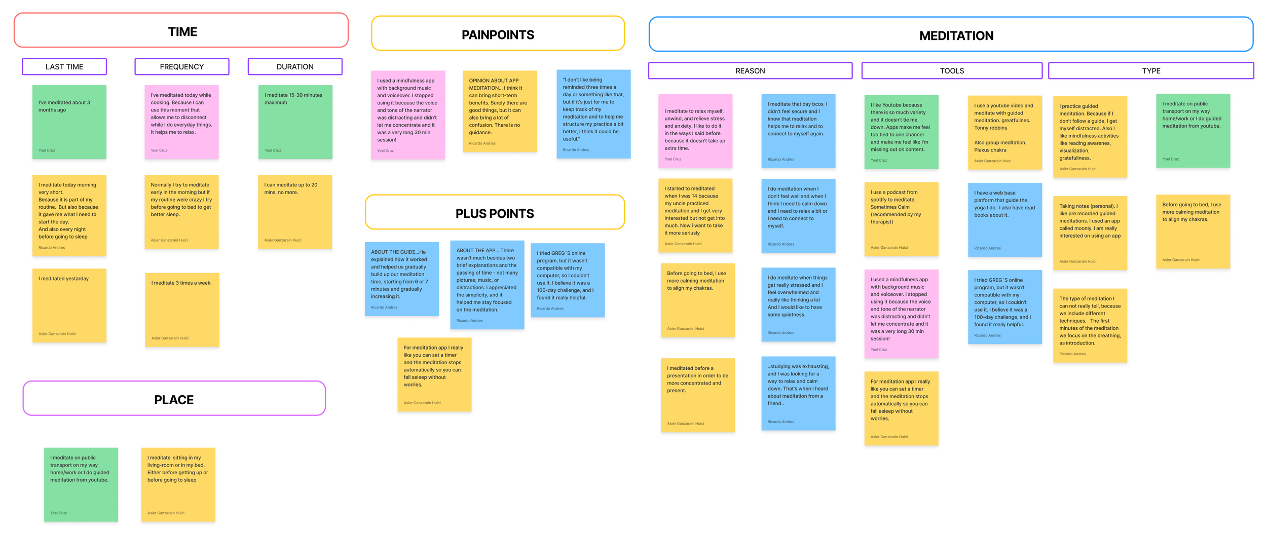
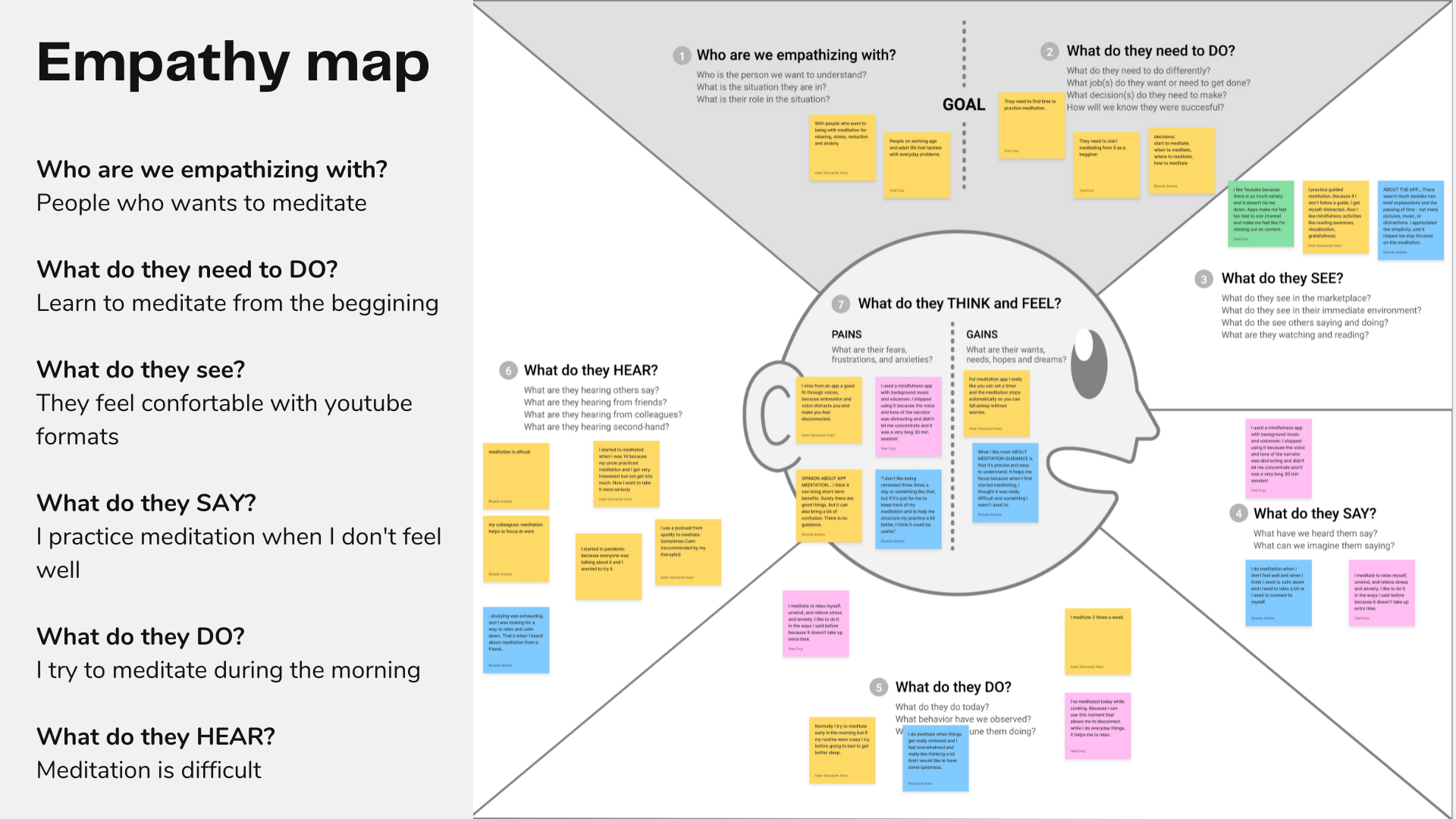
Affinity Diagram & Empathy Map
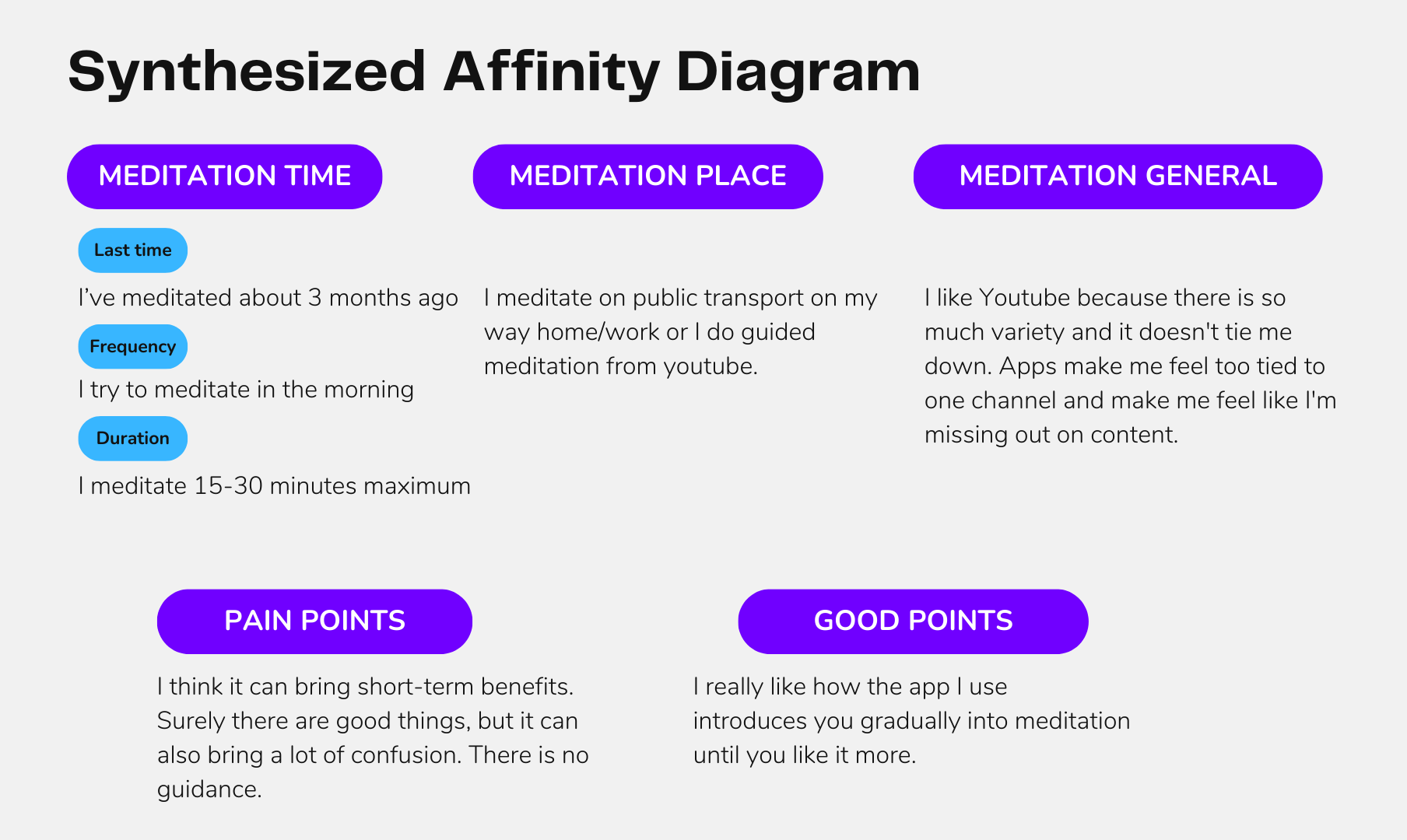
With all the insights collected from the interviews, we built the Affinity Diagram to group the insights according to the topic and have a first glance at the issue.
Then we vote for the most relevant issue to focus on and synthesize the Affinity Diagram.
Then, gathering together all those insights into an Empathy Map, we were able to be in the shoes of the users to understand better the user’s goals, frustrations, pain points and thoughts.
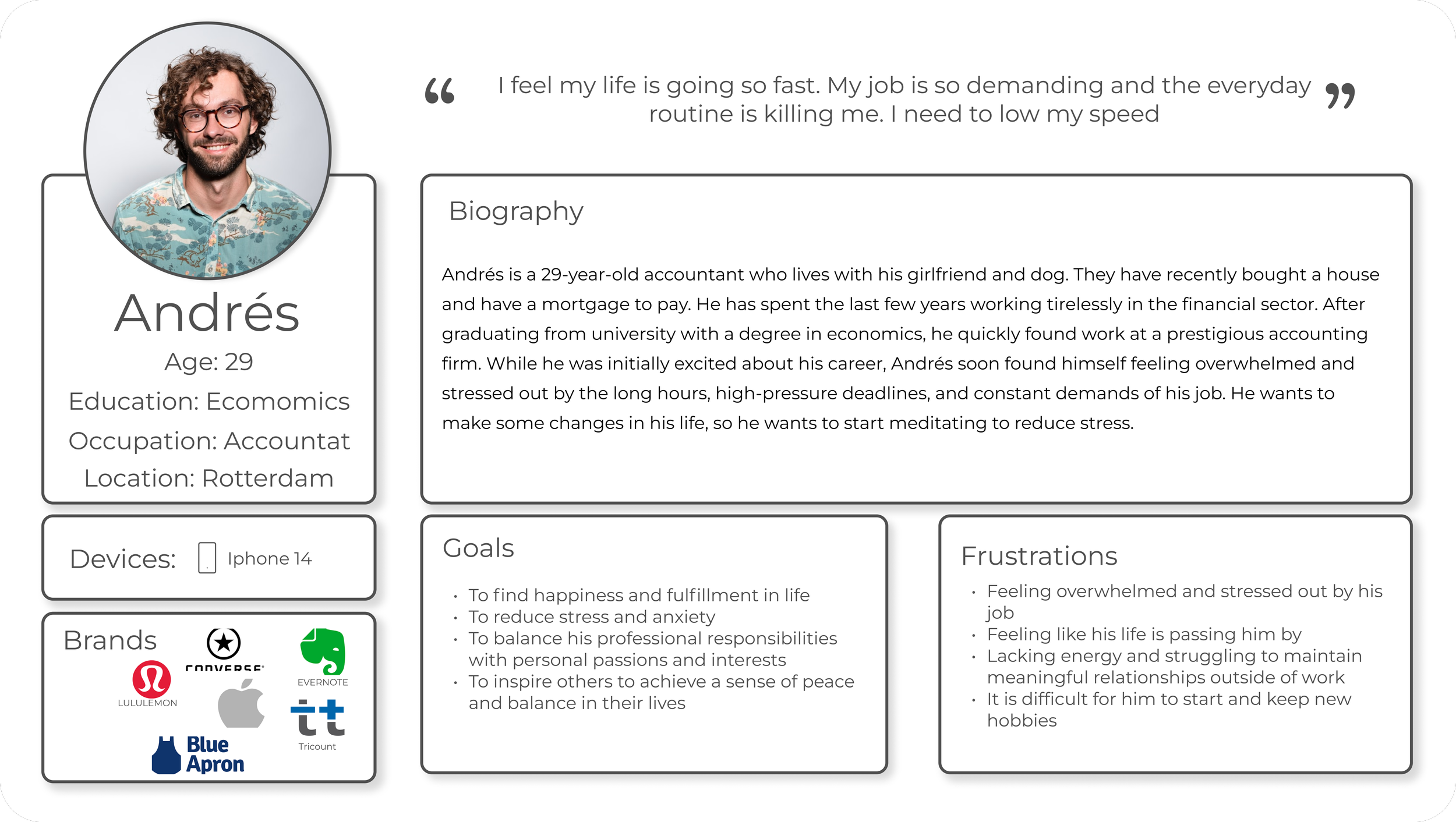
Use Persona
After analysing the insights and empathising with the users, we were ready to create a user persona that could impersonate our main user group. His name is Andrés the overwhelmed accountant. In summary, Andrés feels that his life is going very fast, and his job and everyday routines are very demanding, so he needs to reduce the speed.
User Journey Map
With the user persona defined, we created a user journey map to see how Andrés could feel in a real situation. “Tomorrow there is a great event at his job. He has a presentation in front of the direction team and he is very nervous. Even though he has been practising, he doesn’t feel confident. How is he going to tackle his journey?”
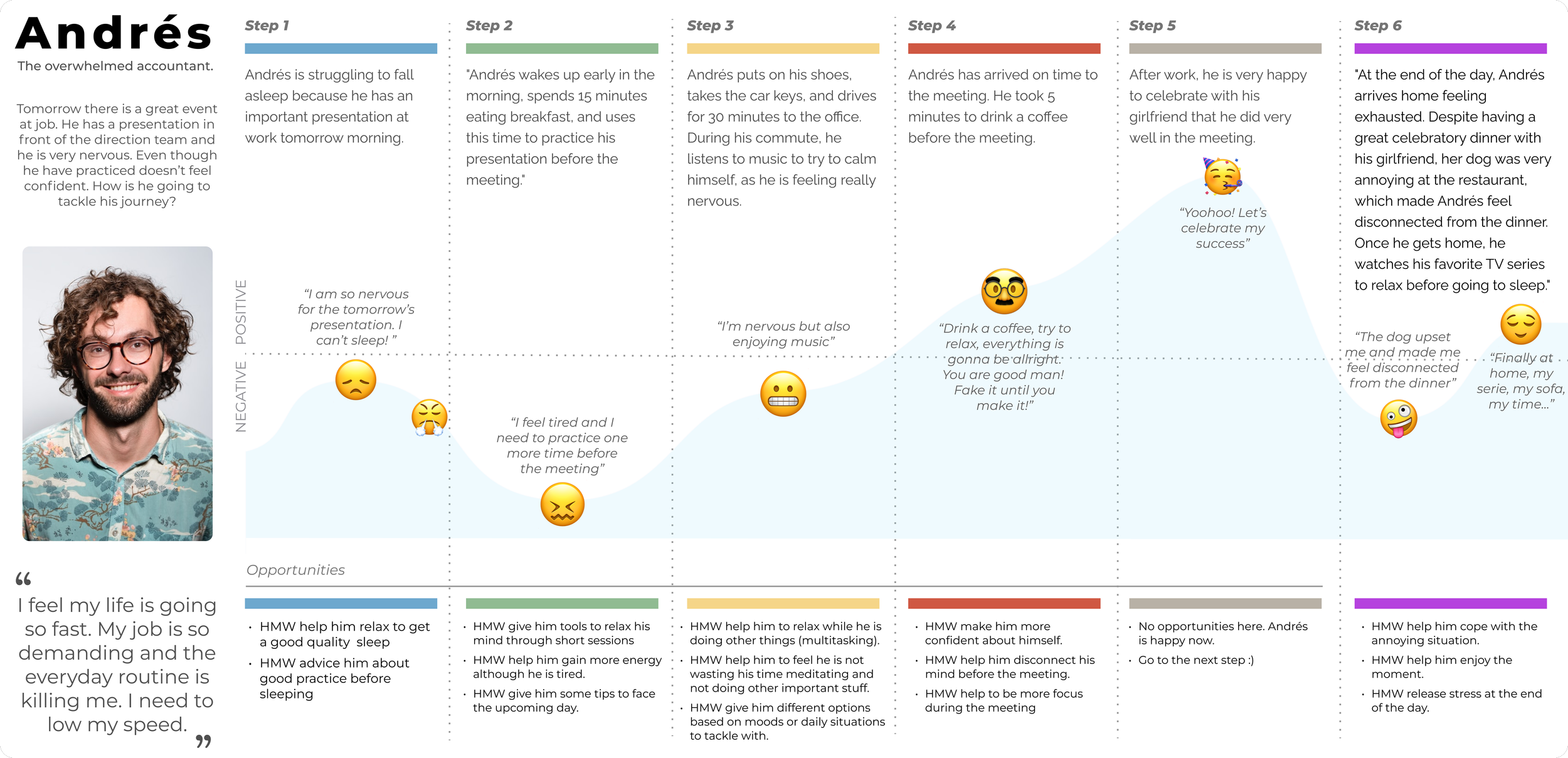
From the User Journey Map, the next opportunities were defined:
Help Andrés relax to get good quality sleep.
Help Andrés gain more energy during the day, although he is tired.
Help Andrés relax and disconnect through meditation.
Help Andrés to be more focused during the meeting.
Problem Statement
After gathering all this data and empathise with the users, we were ready to define the Problem Statement:
The busy and sensitive mid-age worker needs to find a way to handle different mental life situations through meditation because he wants to enjoy, chillout and be more present in life.
Ideation
With the problem statement defined, we could start working on the solution. We started by using the crazy 8’s method to sketch out some ideas that could be included in the meditation app.
MOSCOW Method & MVP
From the crazy 8’s we came up with different features the meditation app could have, so we applied the MOSCOW method to classify them between must-have, could-have, should-have and won’t-have.
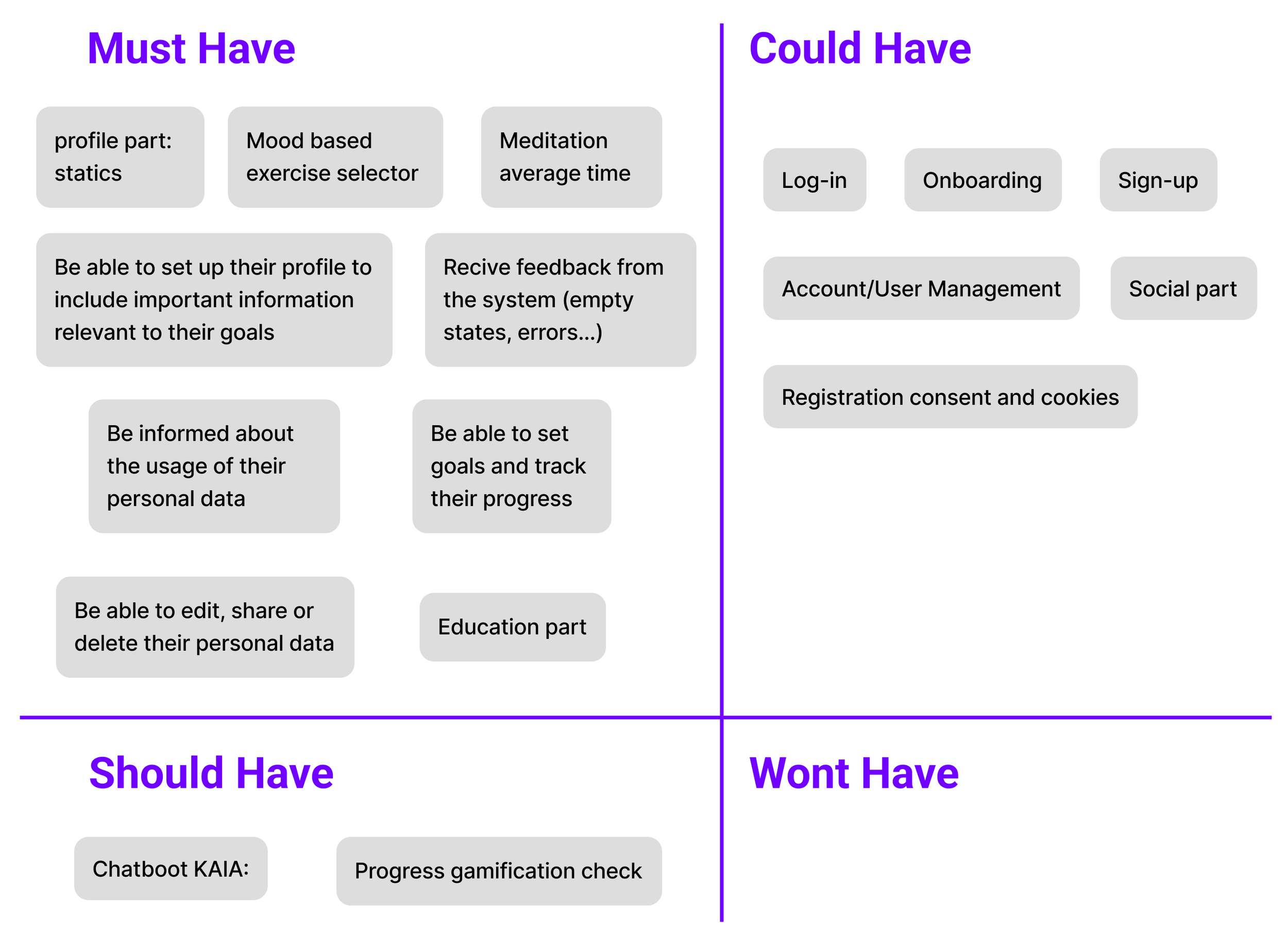
Once we decided the features the app was going to have, we were able to define our Minimum Viable Product.
The aim of the meditation app is to offer tools to its users to begin practising meditation in order to address various mental health situations. As a generalist app, it offers meditation mood-based practices to people, as well as educational tips, and allows users to manage and track their progress through their accounts.
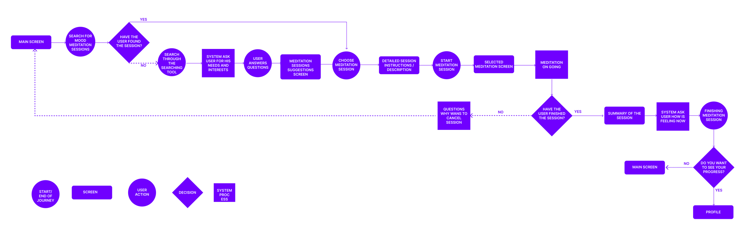
User flow
With the MPV in mind, we could start designing the app, but first, to stay organized, focused, and give structure to the app, we defined the happy path by defining the User Flow.
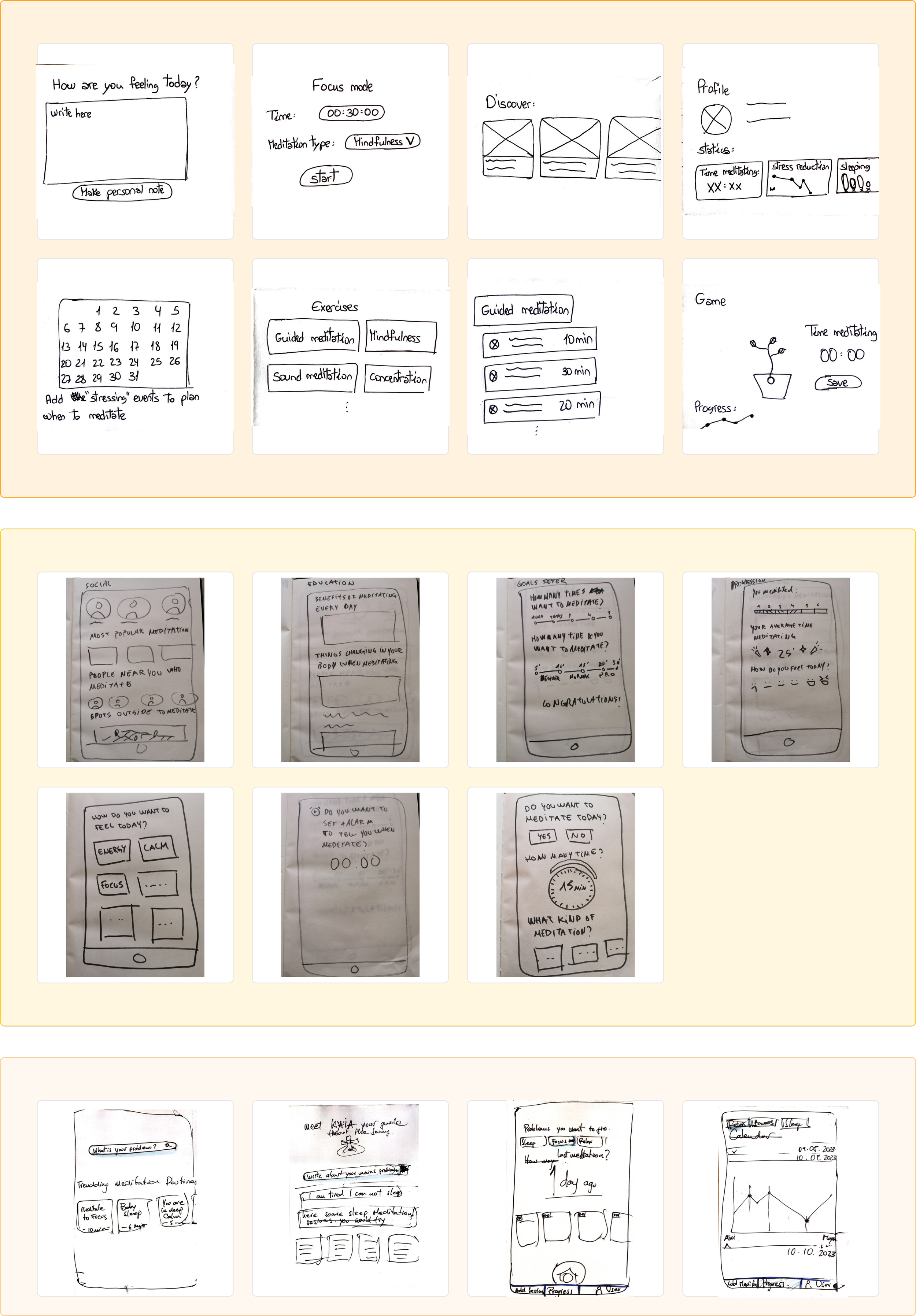
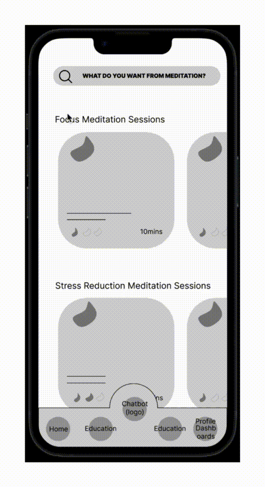
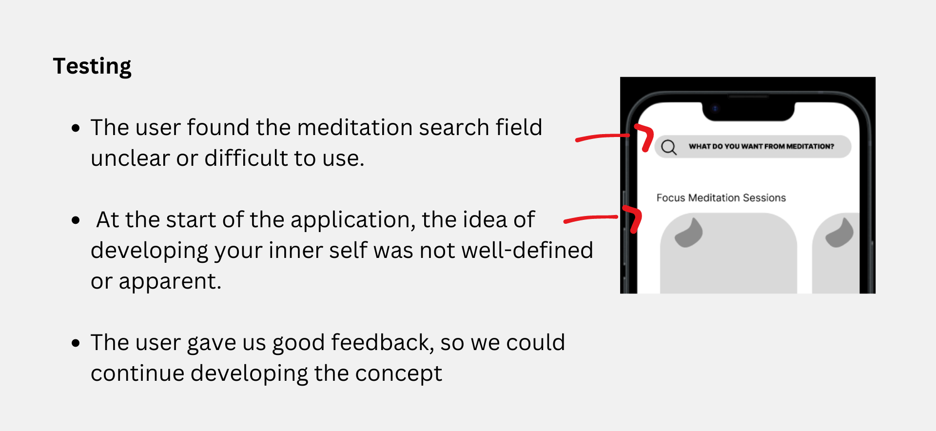
Low-Fidelity Prototype & Testing
At this point, we started creating low-fidelity wireframes in which we defined the basic structure of the app. Through testing, users started to help us polish some aspects like the meditation search field or that some sections weren’t well-defined or apparent.
Mid-Fidelity Prototype & Testing
With the insights we got from the mid-fidelity, we started creating the mid-fidelity prototype in Figma. But first, before implementing any changes, we started creating components and component sets to save time and work.
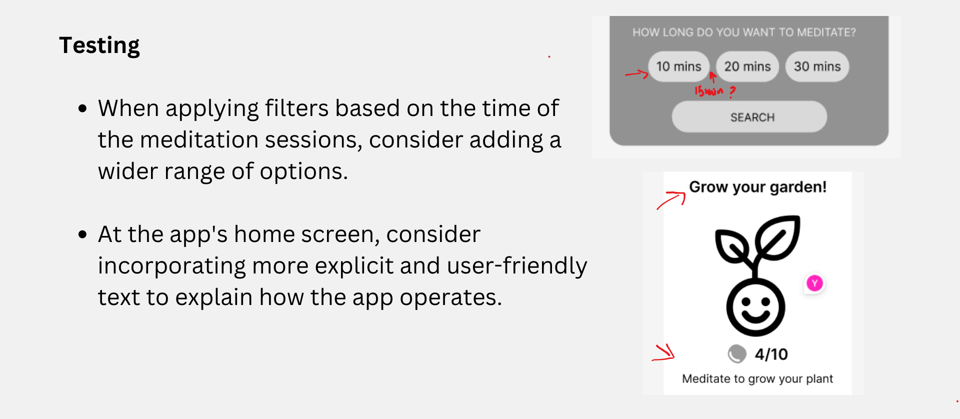
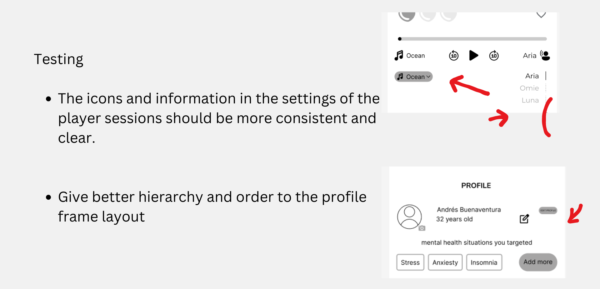
Testing the wireframes, we collected insights to implement in the high-fidelity prototype
UI Part
Once we finished with the UX part, we were ready to start working on the visual aspect of the project.
Visual Competitive Analysis
We started by looking at the visual style of the competitors to see how they communicate with their users. We noticed they generally use dark colour gradients to bring a sense of peace and calmness.
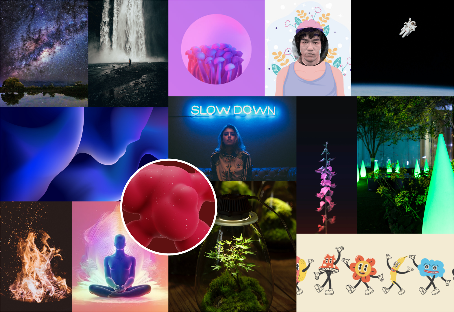
Brand Attributes & Moodboard
At this point, it was time to start thinking about the branding of the app, so we came up with the brand attributes we wanted the app to transmit:
Fluid: adapt to each person's journey to make them feel fully engaged and focused.
Playful: infuse joy and creativity making the app engaging and enjoyable.
Inclusive: it is meant for everyone depending on their meditation experience, ensuring that everyone feels valued and included.
Relaxing: help to reach that sense of calm to let go of any problems, concerns or frustrations.
Self-care: help prioritize each one's well-being, focusing on personal growth, and enhancing a self-care routine.
Then we created a moodboard that reflected all these brand attributes. Dark purplish colours transmitting peace and calmness, with images transmitting motion to feel that fluidity.
Style Tile
Once we had defined the Brand Attributes and moodboard, we defined the Style Tile of the app with the next elements:
Logo: we came up with this kind of drop which simulates a drop of water. The drop is what we need to take care of ourselves, as if we were taking care of a plant, meaning that with each drop we collect, we are working on our personal growth and well-being.
Colours: dark purplish colours transmitting peace and calmness and green colour as a contrast.
Typography: we chose “Magilio” for the headings, to give the app this sense of playfulness, and “Nunito Sans” for the body as it is easy to read and combines nicely with the main typography.
All the elements of the app have rounded corners as they transmit calmness and playfulness.
High-Fidelity components
Before jumping to the high-fidelity prototype, some things needed to be created and planned such as components, component sets and auto layouts, this way we worked on the Atomic Desing.
High-Fidelity Prototype
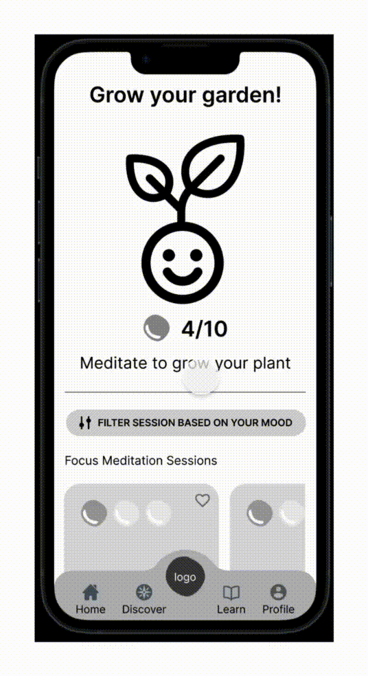
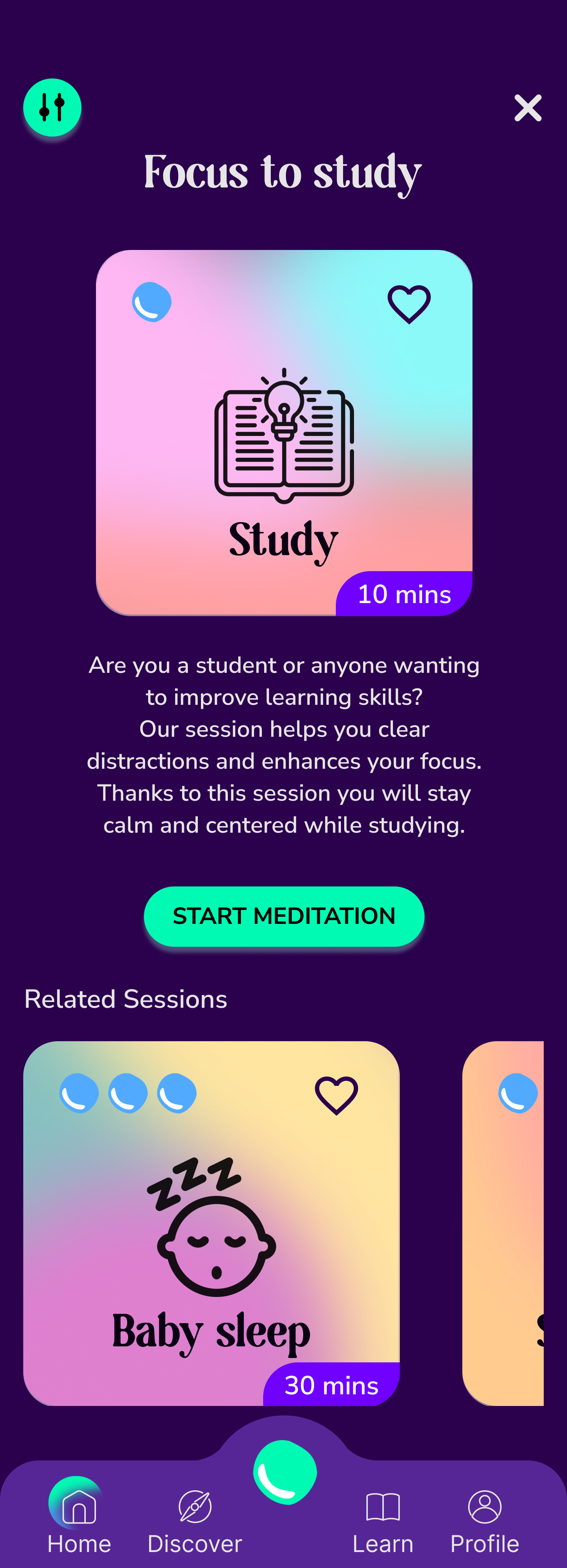
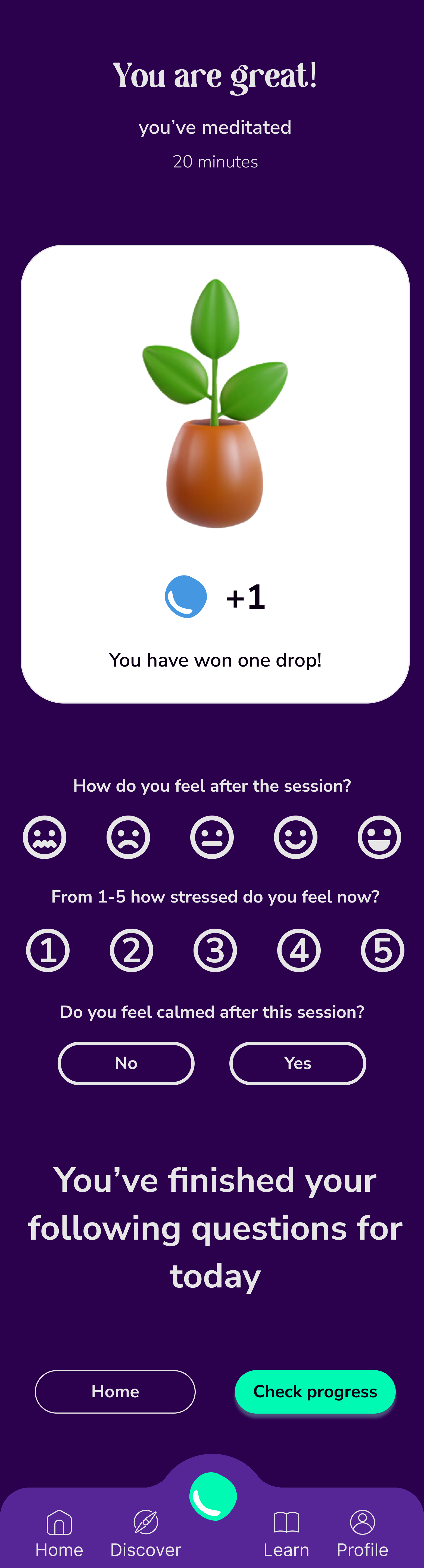
Finally, bringing it all together and with the feedback of the user testing, the high-fidelity prototype was built. The app is about finding the meditation session you need at the right moment. By completing meditation sessions, you gain drops called “droplets”, which make the plants grow, they serve as a reference for how much you have meditated.
Homepage: first we find a card showing our progress and how many drops we are left to grow the plant completely. Then we have the option to filter all the sessions depending on what we want to meditate for and the duration of the session. Next, we will find all the sessions grouped by meditation types.
Filtered sessions: once you have filtered the sessions, a new list of meditation sessions will appear.
Meditation session description: you can find a small description of the session, how many droplets you will earn, how long it lasts, and the start meditation button. You can also find some related sessions.
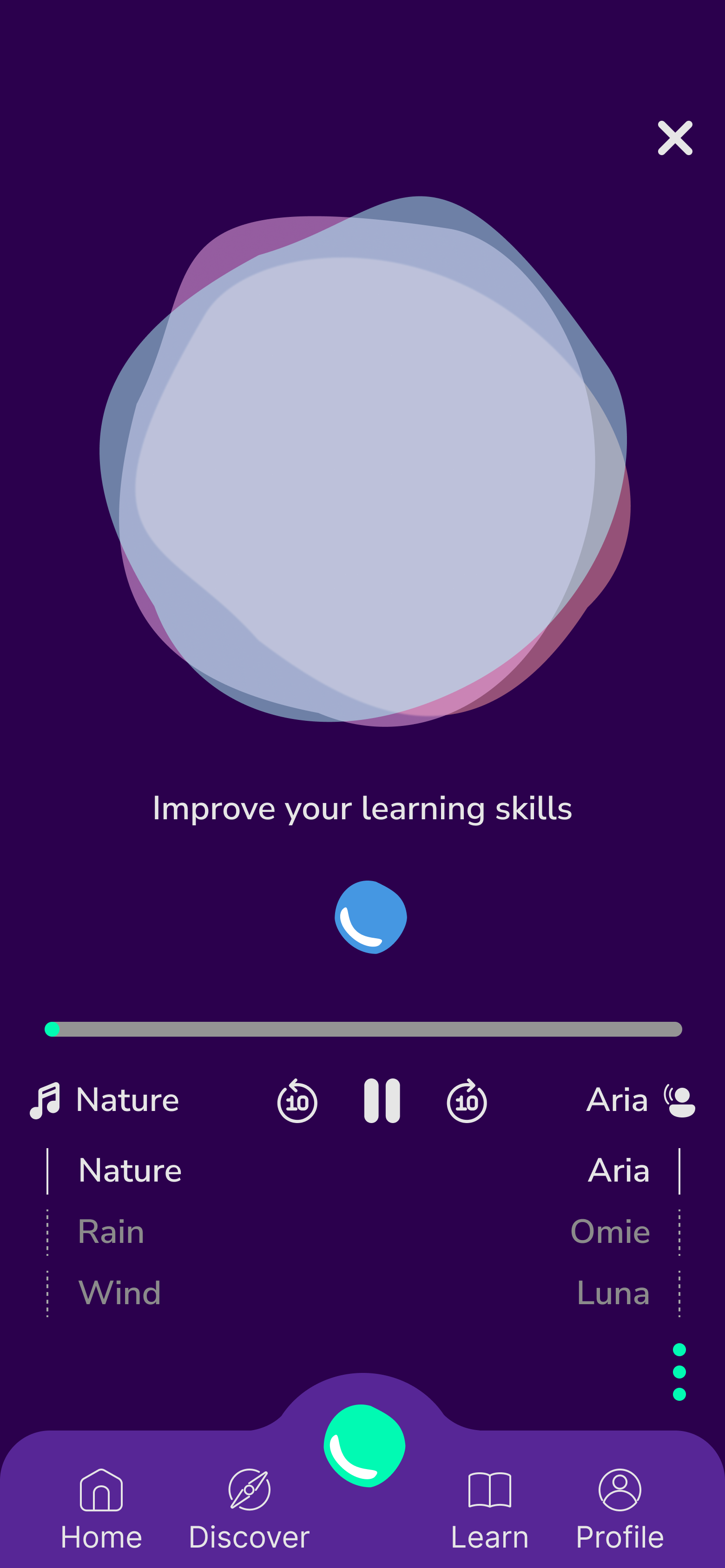
Session in progress screen: when the session is started, you will have the session in progress screen where you will hear the guided meditation and background music. Here you have the typical options such as play/stop or rewind, but also the option to change the voice of the speaker and the background music.
Meditation session summary: once the session is finished, the summary screen will appear telling how many droplets you gained. The user will be asked how they feel after the session, their level of stress and if they have managed to calm down. All these questions are relevant to analyse the progress of each user.
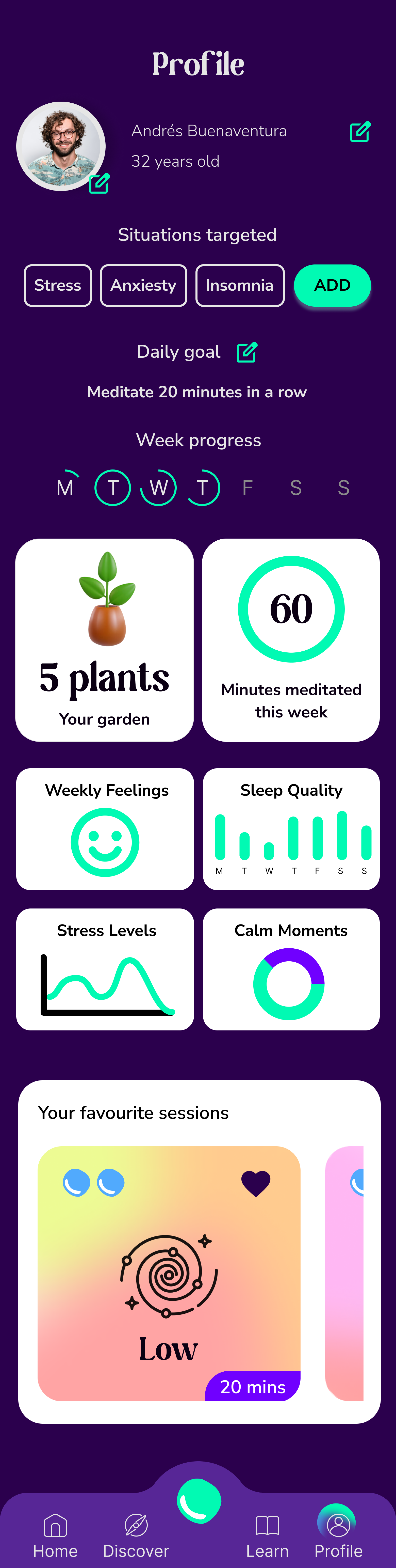
Profile: here basic information about the user is displayed along with the progress of the user and the option to see how many plants are completely grown.
Click here if you want to play with the prototype and see all the features.
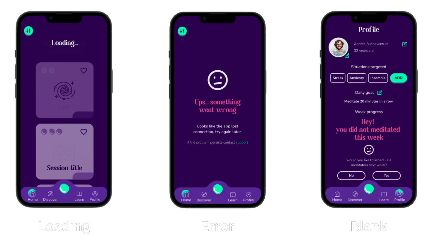
States
As sometimes there will be problems with the app and the happy path doesn’t always happen, we defined some states that could occur: loading state, error state and blank state.
Next steps
This is where we have reached in this project, and these are the next steps:
Test the high-fidelity prototype to receive feedback and improve the app.
Develop discover and learn features.
Explore the idea of adding an AI chatbot as a meditation guide.
Develop all the different states that could occur in the app.
Learnings
It has been a very interesting project to work on and we have learned a lot of interesting tools and tips. These are some of the learnings:
The importance of Atomic Design and creating components and auto-layout so the design has a solid structure and can rapidly adjust to any change. Also, this way of working makes things easier for developers and encourages a good relationship between the two parties.
Start to think about the different states that could occur in the app and think beyond the happy path and anticipate problems that could happen and solve them.
The importance of using components, component sets and auto layouts in Figma to save a lot of time and hard work.