
UI redesign | Shazam
2023


Project Overview
A visual redesign of some selected screens from the Shazam app. A whole new branding evoking an energetic, playful and inspiring sensation with an 80’s style.
Roles
UI Designer | Visual Designer

Individual project

Figma

Challenge
You will select the app of your choice for this redesign. The only constraint is that you must select a well-known native mobile app. You will redesign a minimum of three screens of your choice. You can, of course, redesign more screens, but you are limited to a maximum of 7 screens. You are not required to conduct any UX research.
Shazam
For this challenge, the famous track identifier app Shazam was chosen. Not only it identifies music, but also movies, advertising and television shows by listening to a short audio sample. Just press the Shazam button in the app and let it do its magic. Once it identifies the sample, it will let you listen to a small track of the music, movie, etc, and display more information or let sharing it.
Agenda
The visual redesign
Screen cloning
Heuristic Analysis
Visual Competitive Analysis
Brand Attributes & Moodboard
Style Tile
Atomic Design
High-fidelity prototype
Conclusions & Learnings
The visual redesign
To redesign Shazam's visual style, several steps were to be taken.
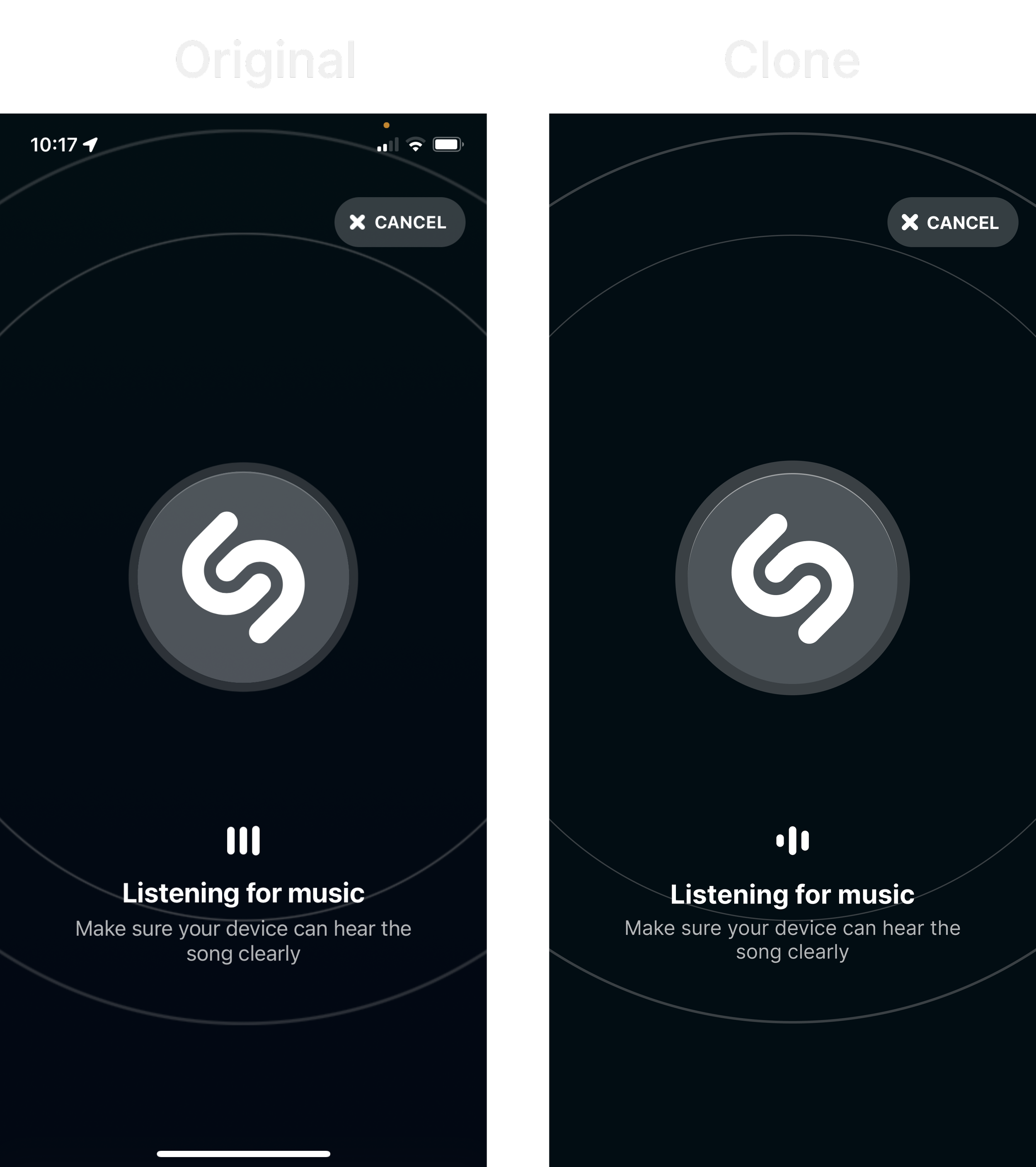
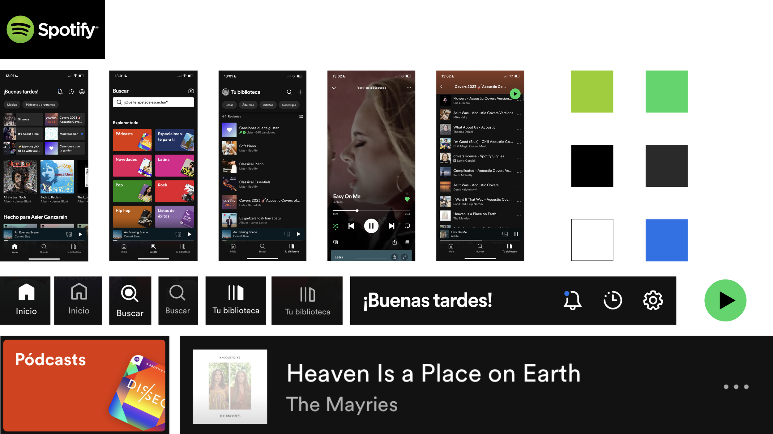
Screen cloning
First, I started by cloning some screens of the app to understand how the app was built and structured. To achieve the cloning exercise, I started by figuring out the layout grid, typography, text and colour styles there were used. Then finally, I created components and auto layout to give structure and place the remaining elements. As Shazam uses simple icons I was able to recreate them in Figma by using the pen tool.


Heuristic Analysis
Then the next step was to run a heuristic analysis based on 10 usability principles to see if there were any usability problems. In the selected screens, there weren’t found usability problems, which confirmed that the app was correctly designed, so only the visual style was going to be changed.
Visual Competitive Analysis
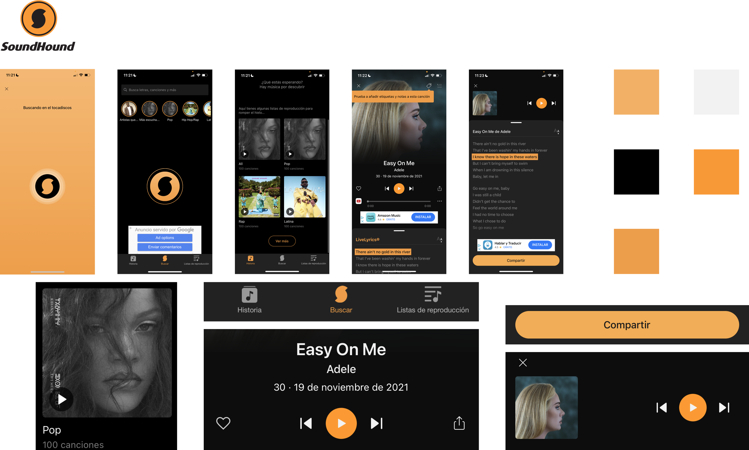
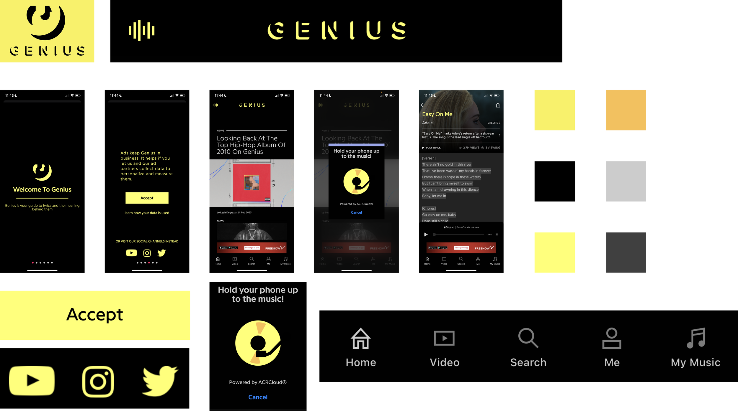
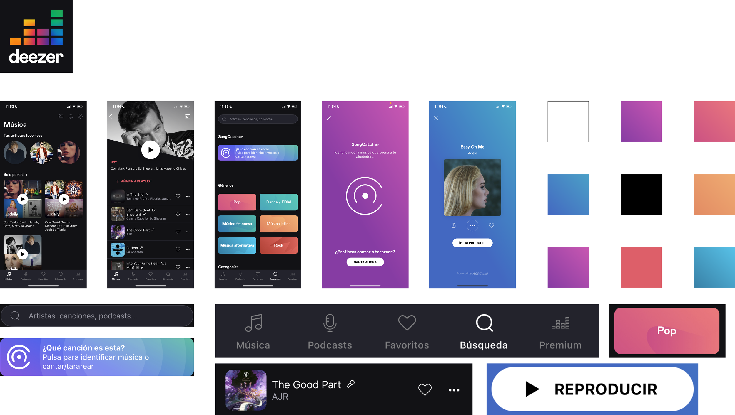
Before starting to think about the new branding, a visual competitive analysis was run to analyse the branding of the main competitors. Also, it was interesting to analyse the type of buttons, icons and navigation styles the different competitors used. The analysed competitors were SoundHound, Genius and Deezer. Also, Spotify was analysed as an indirect competitor as its an app for streaming music.
Brand Attributes & Moodboard
To create the new branding, first I needed to think about what I wanted the app to transmit so I came up with the new brand attributes:
Energetic: music conveys all kinds of energy, transmitting vibrant sensations.
Playful: to have fun alone or with someone while listening to music.
Inspiring: music triggers emotions, sensations and impressions.
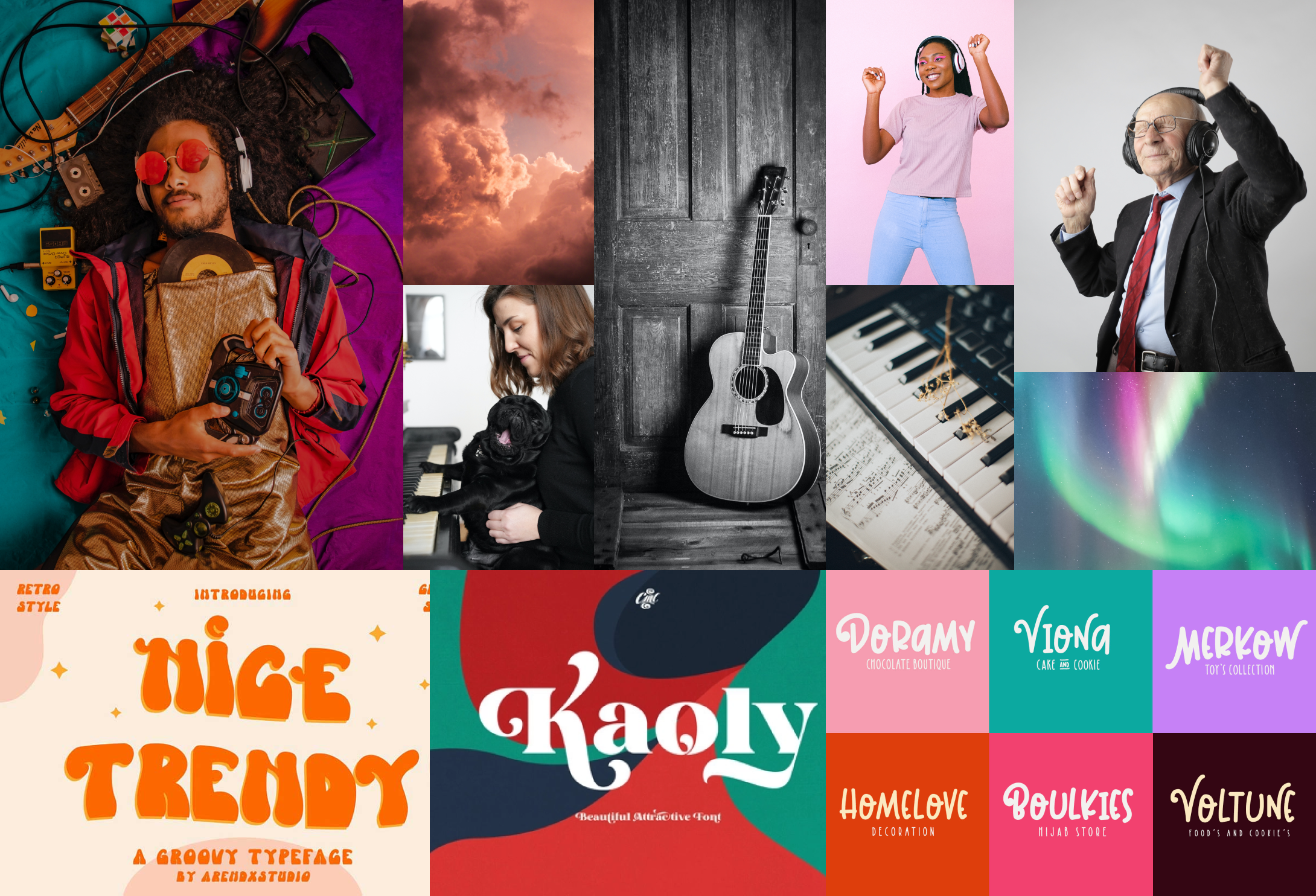
Once the brand attributes were defined, a moodboard was created to visually transmit the new brand attributes and find inspiration.
Style Tile
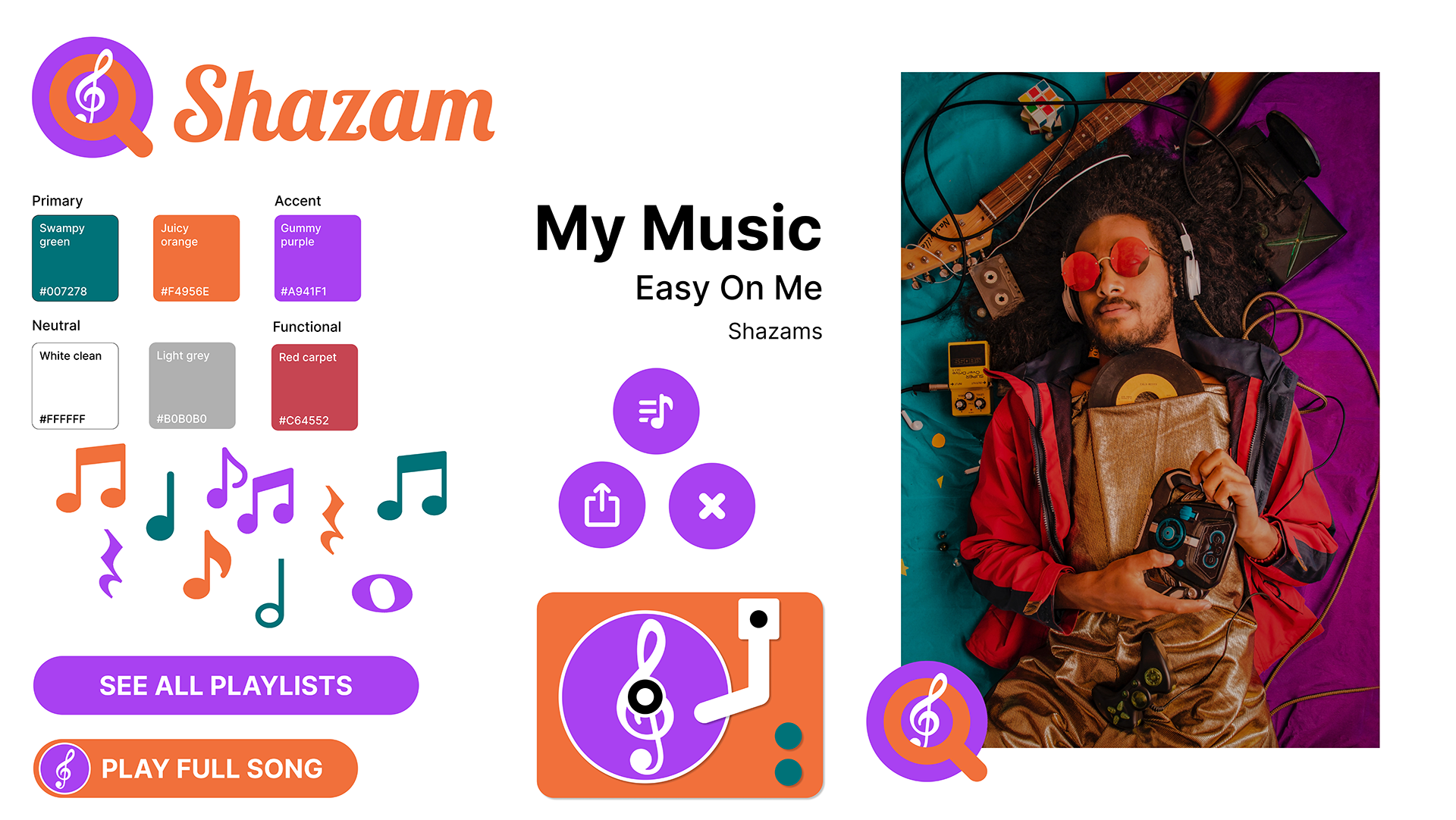
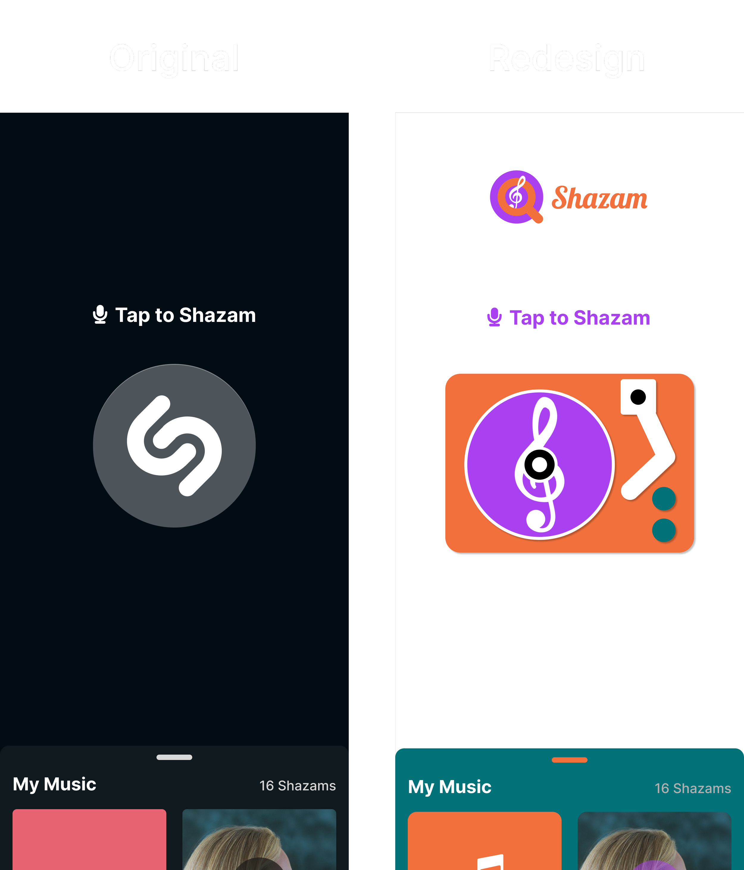
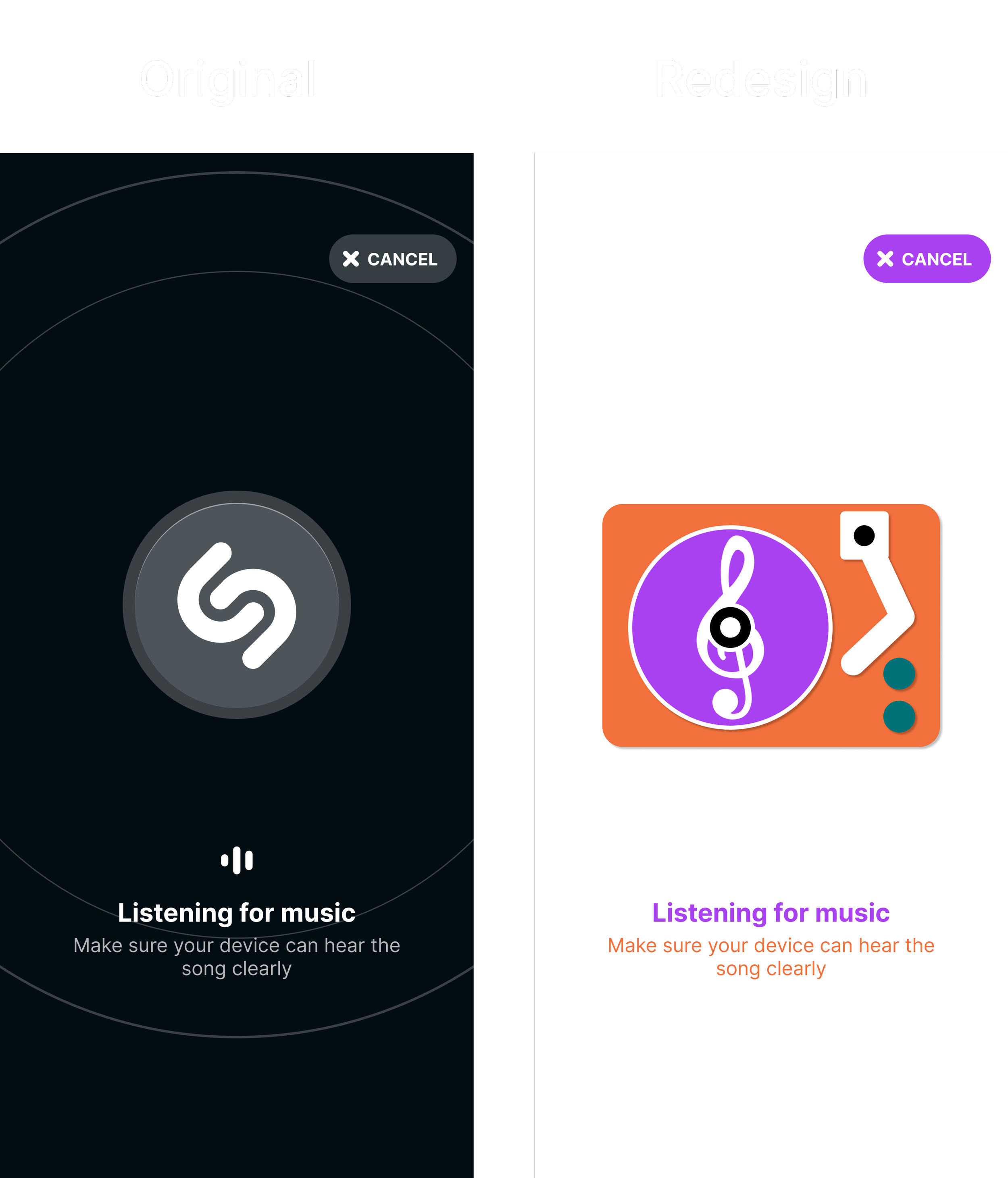
With the brand attributes and moodboard, I was ready to define the style tile and branding. For the new branding, I decided to change the logo completely. As Shazam is an app for identifying tracks, I decided to create a logo which transmitted exactly that by placing a magnifying glass with the treble clef symbol inside, and changing the typography by using “Lobster”. As a result of applying the brand colours to the logo, the new branding was created.

For the new branding, I chose green and orange tones as primary colours and a purple tone as the accent colour. “Inter” was chosen as the main typography of the app, for the different text styles. Also, New icon sets were created to suit the new branding, and I had to come up with a new track-identifying animation, so I designed a turntable to fulfil that.
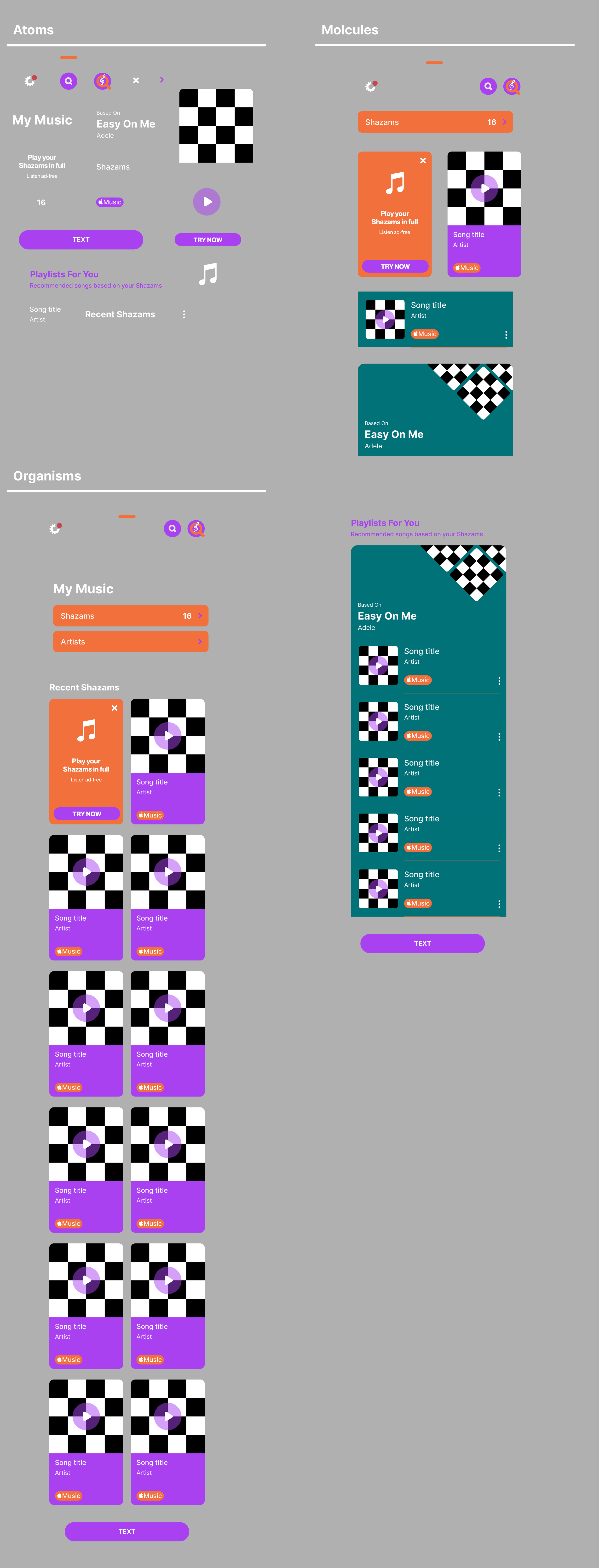
Atomic Design
Before jumping to the high-fidelity prototype, some things needed to be created and planned such as components, component sets and auto layouts, this way the different levels of the atomic design were defined.

High-fidelity prototype
Finally, bringing it all together the high-fidelity prototype was built.


High-fidelity prototype video
Click here if you want to play with the prototype.
Conclusion
This is the end of the project, where the redesign consisted of basically changing the visual style to give a more playful look. When presenting it in the design critique, they told me it remembered them to the ’80s–’90s decades, which was completely compatible with the brand attributes.
Learnings
In this project, I had de opportunity to work on my own and handle it myself facing all the challenges. I got to practice creating components and auto layouts which are very useful to give structure to the design and facilitate work, and we learnt that way of working is called Atomic Design. Also, we learnt about the 8-point grid system which is a very good practice to give consistency to the design and facilitate work by reducing decision-making.